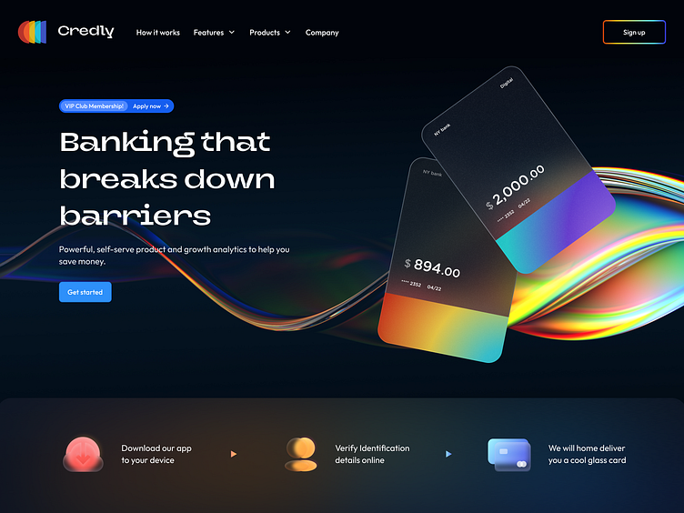
🤑 Credly | Fintech Landing page
Welcome to the future of fintech, where sophistication meets user-centric design. Introducing Credly's landing page, an audacious yet sleek gateway into the realm of financial empowerment.
Conceptualization: At the heart of Credly lies a commitment to user freedom. We've envisioned a platform where banking is not just a transaction but an experience—a journey without barriers. This ethos is vividly reflected in our choice of vibrant gradients that echo a dynamic financial spectrum.
Design Philosophy: With every pixel, we aimed for clarity and accessibility. The hero section boldly declares our mission: "Banking that breaks down barriers," set against the deep, cosmic backdrop that hints at the infinite possibilities we offer. This is not just a statement; it's an invitation to explore the unexplored.
Visual Hierarchy: Our design strategically guides users through the page. The eye-catching presentation of the Credly cards, with their crisp, futuristic design, immediately draws attention to the product's unique value proposition. Coupled with smart typography that balances readability with personality, the page speaks with a voice that's both authoritative and welcoming.
This is CREDLY, where every swipe is a step into the future.
Join us on Dribbble to witness how we're designing the revolution, one screen at a time.
