#DailyUI Day 52: Logo Design
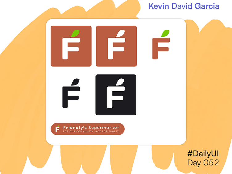
This assignment was interesting, since I had never done logo design before. I decided to create a letter mark for a fictional grocery store. It includes the first letter of the store with a leaf on top of it, a reference to the fresh produce the store offers.
I use two colors, a dark orange and a bright green. The orange can either be used as a background or for the letter. The green can only be used for the leaf. Both elements can be white or black depending on the background.
For the lockup, the letter sits next to the full word mark and slogan.
