Case study: Initiatives
Often, data entry in healthcare is more a technicality (for audits) than a tool to improve care. During my time working with IntusCare, we tried to change that. The information from data collection should be improving the lives of the patients it comes from.
Here, begins the story of a feature I led from conception to delivery: Initiatives. Through many discovery conversations with clinicians at our partner organizations, we were hearing time and time again that it was difficult to tell if an initiative they were trying to implement was working. Especially on a group-level, it became really hard to track changes and understand if they were making an intentional and substantial impact on their participants’ health. There were many barriers, but one of the biggest was data. It was hard to get the right data that would tell them an accurate story, and clinicians are too busy addressing participant’s daily needs to be fighting computers and spreadsheets for the information they needed. This is where we could come in as a software tool.
Summary
Designed the MVP for a feature enabling clinicians to track the outcomes of their interventions with data, saving them time fighting Excel and datasheets, and empowering them to do more of what works for participants and less of what doesn't. Utilized iterative prototyping to take in feedback from beta testers before general release to ensure maximum usability and value.
Step 1: Observational Research & Value testing
First, I designed a research partnership with a couple clinicians running an initiative at their organization to get more in-depth observation on their workflow and changing information needs at each step. The initiative was an educational pre-diabetes workshop series to encourage preventative behavior in participants, so we sat in on workshop sessions and met with clinicians during planning, analysis, and reflection stages in their workflow. To test out the value and if users would actually use the information, we did a wizard-of-oz model where we would provide data visualizations they needed at certain points. It was invaluable to see how they used the data at different points in their workflow: from reflection during the implementation phase, to analysis, to planning for the next iteration. And we also learned what kinds of visuals they needed, why, and for whom.
Step 2: Wireframing & prototyping
With that knowledge, and more user interviews to gather a broader understanding of initiative processes across organizations, we begin wireframing and identifying our current tools’ value points and weaknesses. After numerous rounds of feedback with internal and external stakeholders, we were ready to create a hi-fi prototype and build an MVP to release to beta customers.

Step 3: MVP + beta testing
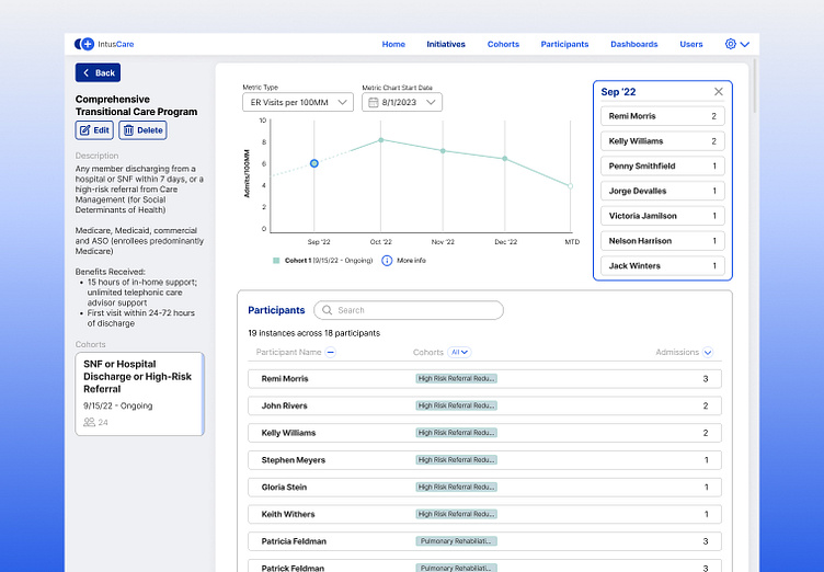
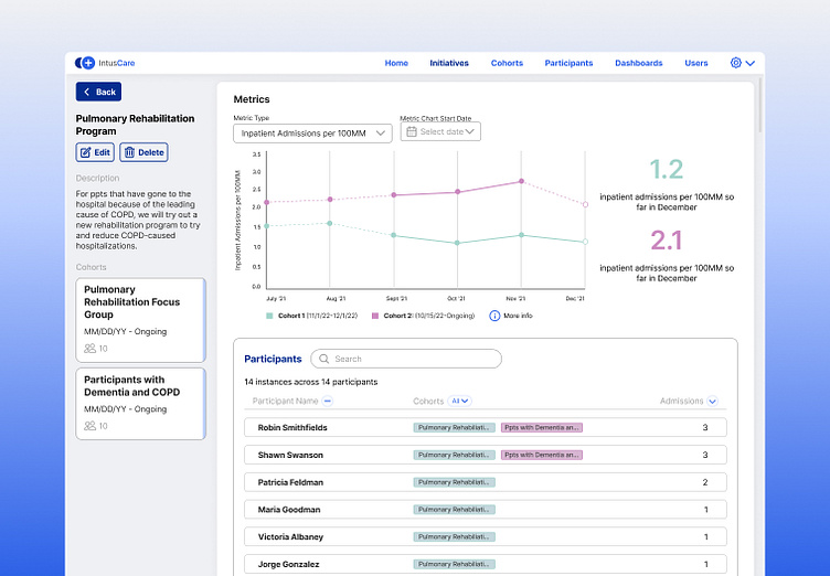
The MVP and beta tester feedback taught us a lot about the value our product could bring to the table. Customers used the feature to track a variety of initiatives, from COPD winter kits to high touch lists. And with that initial success, we made some minor tweaks (including an interactivity element with the graphs where users could click into each data point, pictured below) and released to our general user base. Sales team was able to circle back to customers who had been asking for a similar feature with the release, and we were able to track usage across a broader range of users. With a rapidly increasing pool of use cases, we set our curiosities, next, on expanding our data sources to meet the rising needs so that an ever more diverse range of initiatives and initiative leaders can track their initiative impact with our tool.