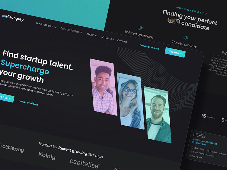
Wilsongrey Website & Branding
Overview
Wilsongrey is a UK-based specialist recruitment agency for startups, focused on SaaS, FinTech, and HealthTech. It provides tailored recruitment solutions for companies and representing individuals in the startup sector seeking their dream job.
Challenge
Wilsongrey's previous branding lacked cohesion and failed to align with the brand's character and values. Developing a new branding was essential to craft a more representative brand image. Furthermore, the existing website grappled with significant issues, such as information architecture and navigation. The primary objective was to identify and address user problems and challenges encountered during task completion in order to provide a higher conversion rate and user satisfaction.
Solution
In the initial phase, we developed a new logo and branding that effectively conveys the brand values. The outcome was a comprehensive brandbook, encompassing guidelines for the proper usage of the logo. Following that, we redesigned the entire website, incorporating the newly established branding, and made substantial improvements to the overall user experience. Our particular emphasis was on optimizing user journeys.
Outcome
New modern and minimal branding
Comprehensive brandbook
Social media templates
New website designs for desktop and mobile viewports
Components library
Documentation
Website built in Webflow
Scope of work: Branding, UX Research, UX Design, Prototyping, UI Design, Animation
Hire us, we're available! 👉 hello@mgdesign.cc
—
Show us some ❤️ love! Press "L".
Want to see more designs and case studies? Visit our profile or mgdesign.cc and don't forget to follow us!


