IQAir exposure screen redesign
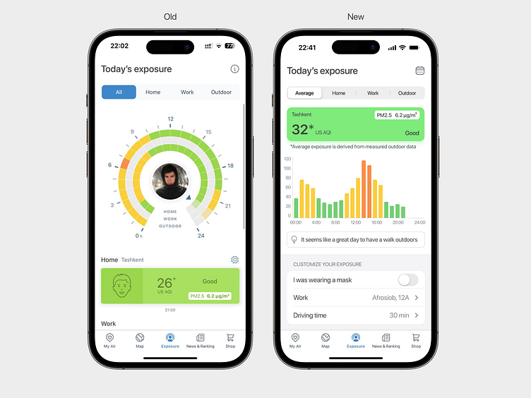
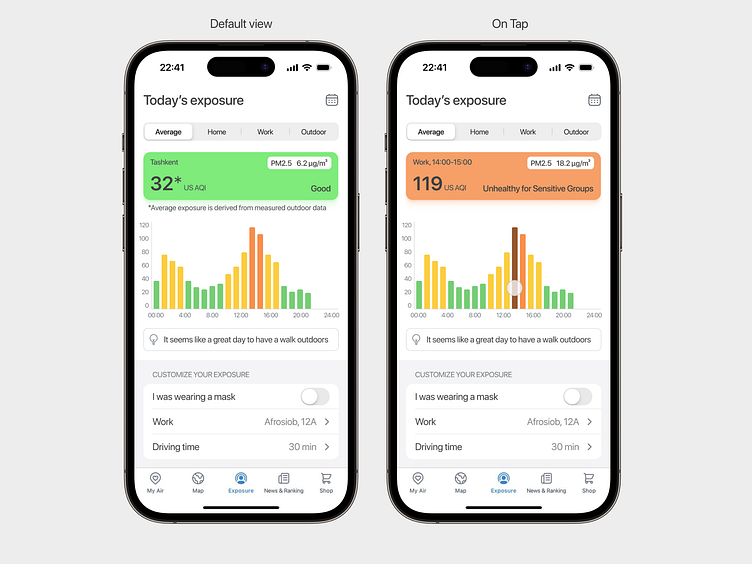
For the last month I've been using IQAir app to track air pollution in Tashkent. While using the app I've stumbled accross the Exposure screen and started checking how I'm affected with air pollution from day to day. Based on my experience I've found some lack of information available on this screen, for example I couldn't seek data from previous days or I couldn't see specific numbers of each hour rate. Based on this I decided to change graph to an easier view and add "on tap" interaction. On top of this I let my imagination out and added an idea of formula for average exposure of the day that can be changed based on settings below. Finally, I've added some UI changes, so the screens look clean and fresh ✨