The Harley Hospital Project — a case study
This case study documents the design of an app that will migrate users from the disparate phone/in-person system currently in use, to an integrated online booking app. It is an example of a Agile Team working remotely across 3 countries.
I will walk you through my team’s final design solution — including our design process — in 3 stages:
The business objectives, followed by
The insights, ideation and solutions, and finally
Usability testing, findings and recommendations
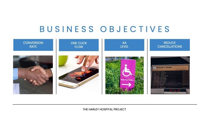
Our primary business goals encompass a strategic shift from telephone appointments to our user-friendly app — with strict adherence to AA accessibility guidelines, a significant reduction in appointment cancellations and the implementation of a ‘one-click flow’ booking system.
Our mission was to create a solution that not only aligns with Harley Hospital’s business objectives but also resonates deeply with the needs and expectations of our users.
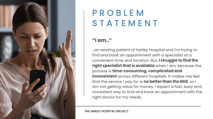
We took a comprehensive mixed-method research approach, delving into competitor analysis as well as user interviews. We used these findings to create our problem statement, an empathy map and user personas to ensure we kept the users needs at the forefront of our decision-making.
Through this process, we uncovered 4 key insights that have shaped our design solution.
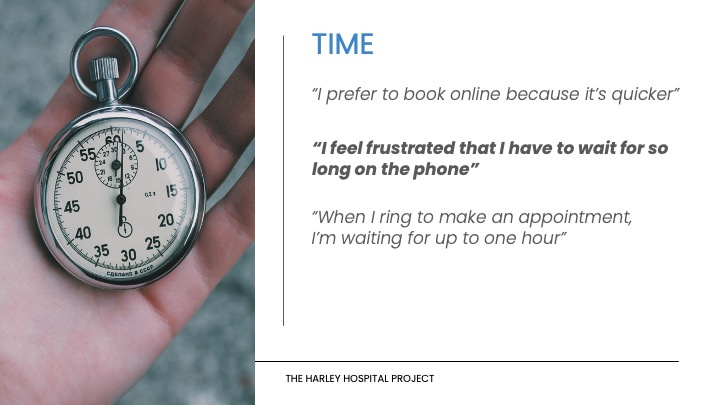
Our users, leading busy lives, expressed a strong desire for ‘time efficiency’ in the appointment booking process. Waiting on the phone was a significant pain point. Members of paid private healthcare systems expect a better booking experience compared to the NHS.
Our research uncovered a need for a simplified, unified and consistent online booking system. Our users find the current process stressful and complicated.
We recognised the need for flexibility and convenience, users expressed a desire for 24/7 access to booking, managing and tracking appointments. They want to be able to access their booking system anytime and from anywhere.
Users expressed a need for a booking system that enables them to easily track and manage appointments reducing the risk of oversights, missed appointments and cancellations — which they repeatedly said caused a lot of stress.

As with any UX design challenge, we used our initial user insights to understand the issues that we feel Harley Hospital’s members are facing.
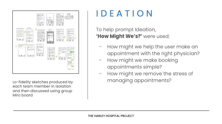
So, we asked “How Might We…”
…Help the user find the right specialist?
…Make the booking process simple?
…Take the stress out of remembering appointments?
With these questions as our guide, each of us went away and came up with our own low-fidelity wireframe sketches. We then came together on our team’s Miro board to discuss each other’s solutions.
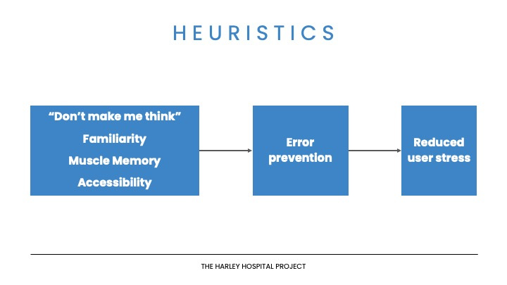
We took the parts that displayed proven UX design principles such as:
Keeping a logical hierarchy with an obvious progression from A to B;
Consistency across the app with a familiarity to established design principles
Accessibility for all of our users.
Following these principles gave us the best chance to help users reduce stress induced errors, leading to an increase in customer satisfaction.
So what did we come up with? Our prototype focused on the four main challenges our users face:
Time
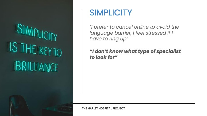
Simplicity
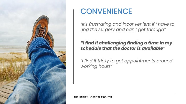
Convenience
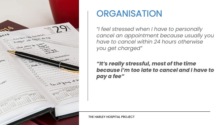
Organization
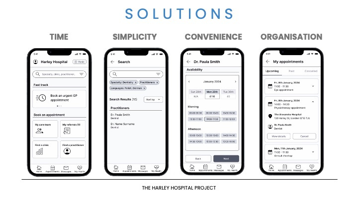
We save TIME by showing tools frequently used tools first— such as Urgent GP Appointments (with it’s fast-track booking feature), the My Care Team, and My Referrals so users don’t have to sift through multiple layers to find what they use most.
We have SIMPLIFIED the search feature using: pre-filled filters based on what users are looking for; and the use of predictive text.
For user CONVENIENCE, all available appointments are displayed with the earliest available appointment pre-selected. Users can choose what works with their schedule.
The app then stores and ORGANIZES appointments and exports upcoming ones to the personal calendar of the user automatically with little effort.
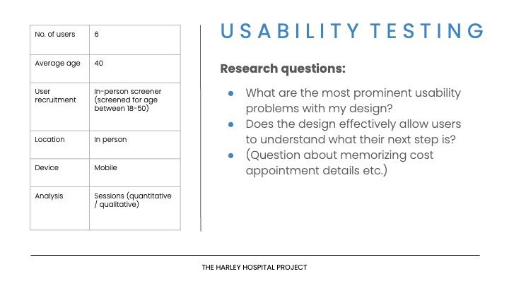
We aimed to document the effectiveness, satisfaction and comprehension of our proposed solution, with the goal of understanding the user’s, thoughts, emotions and potential pain points.
Our participants were between the ages of 18-50, as per the project brief, and the average age was 40.
All sessions were done in person and moderated, we gained both quantitative and qualitative data.
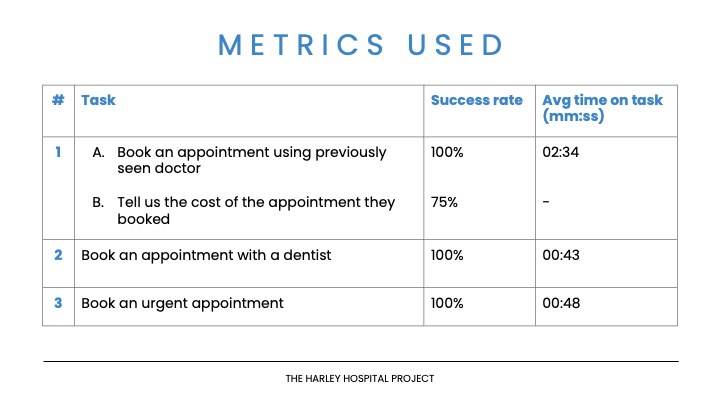
Our completion success rate was 100% for all tasks — apart from task 1b where users missed the cost of the appointment.
Time on task, was much higher for task 1 compared to 2 & 3, our hypothesis for this was either because it was the first time they interacted with the app, or due to the nature of the task.
Importantly, after the first interaction, average time on tasks are all under 1 minute — which was a key business objective.
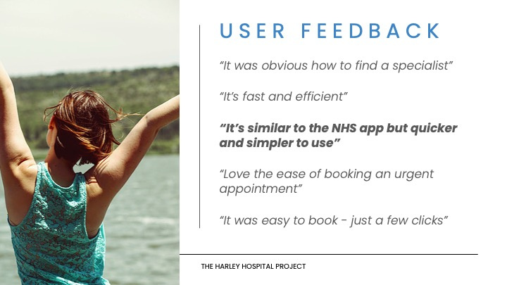
Qualitative user feedback showed we had success in all areas. Discovery research users said they expect a certain level of usability since it is a paid service, and the quote in bold type demonstrates that users would be satisfied with this service.
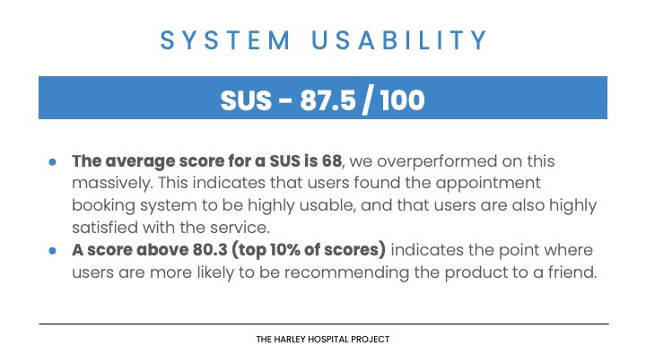
For assessing usability and satisfaction, we used SUS, which is a widely used, reliable scale, which work well with small sample sizes.
A score of 68 or above indicates a usable system, our solution scored 87.5 — which not only indicates a highly usable system, but also high user satisfaction to the point where users are likely to recommend the product to a friend, which, according to the business objectives, will support one of the client’s key performance indicators — conversion from telephone bookings to use of the application, and this suggests our solution will achieve this.
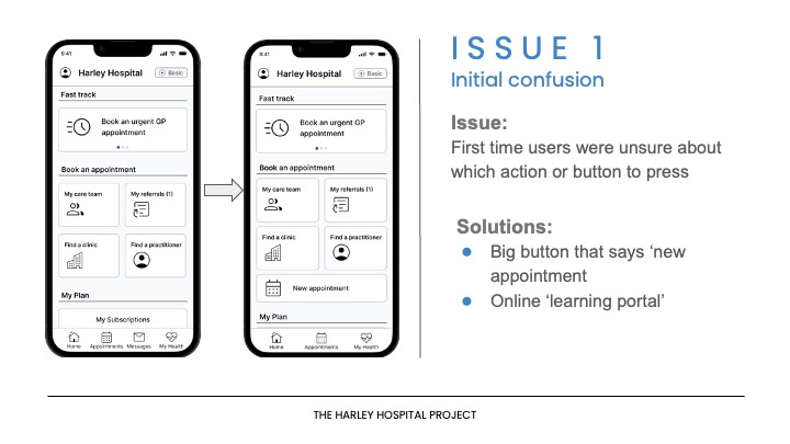
As expected, issues were found and addressed. The first of which was confusion for first-time app users, which confirmed our unfavourably high average ‘time on task’ for their initial interaction.
One solution to this was a big button that says ‘new appointment’, so if users are unsure of what button or flow to press, they can press the new appointment button and it will take them through the primary booking flow.
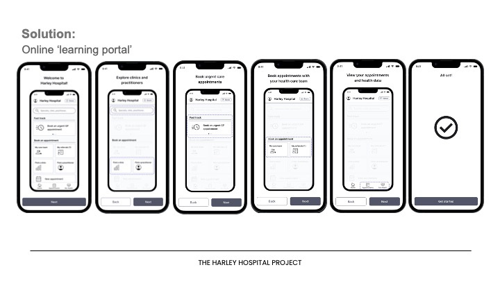
Another solution proposed is an onboarding tutorial of the application, shown the first time the users interact with the app, guiding them through all available options.
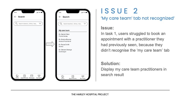
Another issue causing the initial high completion times on task 1, is that the ‘my care team’ tab was not recognised by some users as a path to see their preferred practitioners.
As our research showed the search bar to be the users’ favourite entry point to booking an appointment, our solution was to pre-fill the ‘my care team’ at the top of all results. This integrates with all of the user flows and provides the user with more options when booking an appointment.
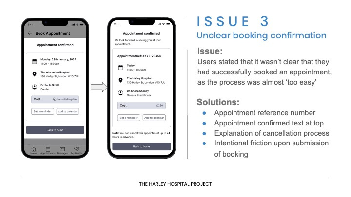
An issue that was uncovered from the analysis of qualitative data was that the booking confirmation was not clear. They were unsure if they had done it correctly as the process seemed ‘too easy’.
With something as important as a medical appointment, users need to feel like they have successfully completed it for their peace of mind, so we added confirmation text at the top along with an appointment booking reference number, which was also requested by users in usability tests.
Finally, we added intentional friction, which by adding a time delay, allows the user to scan the details of the confirmation, increasing their recall for appointment details, such as cost — which as you may have noticed scored 75% on the SUS scores.
Through research and usability testing I can say that our team has created a solution that solves the users’ key needs associated with time, simplicity, convenience and organisation and is aligned with the client’s business objectives.
I was part of a multi-disciplined Agile Team and played a key role in all phases of the project, taking the team lead at the beginning and alternating where our strengths were most useful. My input was most relevant, but not limited to:
user flows
user testing and analysis
insight gathering;
empathy mapping
wireframing and prototyping
Figma Prototype:
