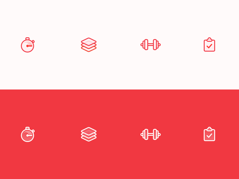
Ignite tab bar icons
We've revised these fellars a couple of times while Ignite has been in beta, but we've settled on these versions.
It's the second time we've used a combination of lines and semi transparent fills. Really liked how the toolbar icons we designed for Pushh turned out so we decided to try that style again for Ignite.
They're on two backgrounds as the background of the active tab bar item gets a different color.
We’re getting pretty close to launch now. If you're interested in getting notified when Ignite is ready don’t hesitate to sign up on getignite.io
More by Yummygum View profile
Like
