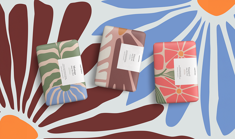
Mesh & Bōne Soap Packaging
The design rationale for Mesh & Bōne soap packaging takes into account both in-store presence and online shopping appeal, which is essential in today's retail landscape.
The patterns and colors are chosen to evoke the sensory qualities of each soap. For Moringa, a pattern with green hues reflects its natural and revitalizing properties.
Vitamin C's packaging is vibrant and fresh, suggesting its brightening effects. Charcoal's design incorporates darker, muted tones for its purifying attributes.
The design choices for the Moringa, Vitamin C, and Charcoal soaps are intentional, aiming to intrigue and inform customers, leading to a memorable brand experience and ultimately, purchase.
Given the smaller visual real estate on the soaps, the contrasting colors and bold patterns are designed to stand out in online listings and be recognizable at a glance.
If you have a project you'd like to collaborate on, I'm ready to join forces.
Feel free to reach out to me at info@janarawlins.com
Let's bring your vision to life together!
Check my other socials, so you never miss when I post the next one:


