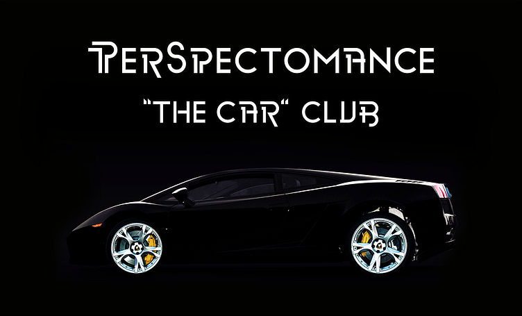
Logo & Logotype Design | PerSpectomance
Perspectomance SA is a Swiss premium “ Car Club ” which brings car passionates together with their ultimate sports, super and hyper cars. Client asked for a logo design that looks strong and kind of minimal.
P letter in the logo doesn't only represent the first letter of the PerSpectomance. With adding a dot inside of the letter P; it also represents an eye of a cheetah, one of the world's most-recognizable cats known especially for its speed in a very minimal way. Checkered flag represents racing and the shield figure around it represents power and being solid. Also the dots on top of the shield represents the spotted coat of cheetah. The curved line in the left side of the logo represents the long exciting roads and also the S letter in the PerSpectomance.


