Tractor Beverage Co. | CRO
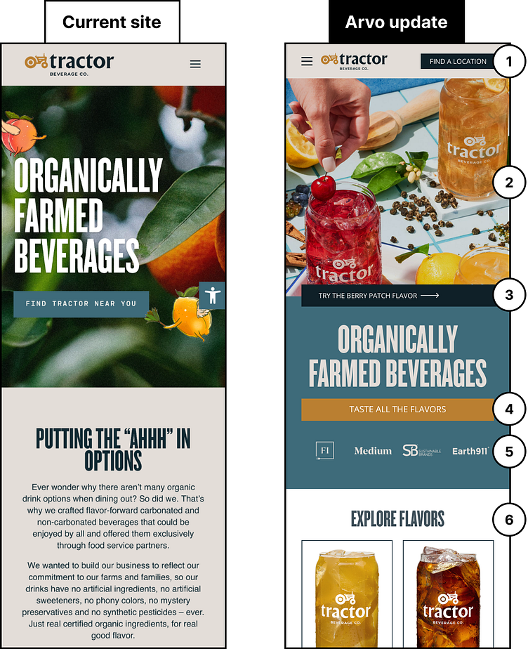
You want to see a brand that is crushing it?? Tractor Beverage Co. understands its audience. We love what they are doing so much we spent some time mocking up 6 ways we'd test to increase the overall conversions!
1) Entice users with a CTA in the navigation. Give them access to your top goal without having to scroll or search.
2) Separate copy from the image so both can be communicated more clearly.
3) Add a secondary CTA that will take them to the product that is featured on the hero image. Directing interested users to the actual product page increases chances of conversion!
4) Make user engagement easy by ensuring key action buttons are full-width on mobile, and sit at the bottom of the fold.
5) Add brand logos for users to gain more trust in your product or brand!
6) Adding product cards to the homepage is a great way to get users into the purchasing funnel, but let’s utilize the space with a 2 product grid so that users don’t have to scroll too far down the page.
