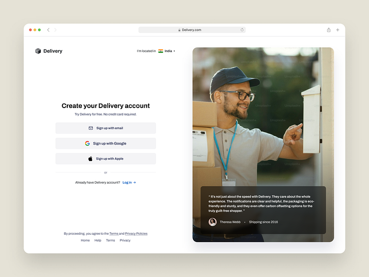
Create account page
Some of the good user experience patterns that I can see in the above design are:
The webpage has a clean and intuitive interface for account creation, with a white background and black text that is easy to read.
The webpage provides multiple options for signing up (email, Google, or Apple), which gives users flexibility and convenience.
The webpage has a clear call to action with a large button that says “Sign up with email” and a smaller text that says “Already have an account? Log in”.
The webpage includes a positive testimonial from a customer, which can build trust and credibility for the service.
The webpage has a minimalistic design that does not distract from the main goal of creating an account.
Liked our work and want to work with us?
Email us at 📩 hi@dvinu.com or 📞schedule a call
---
Follow us on Dribbble • Twitter • LinkedIn
Visit our website 👉🏾[dvinu.com]
