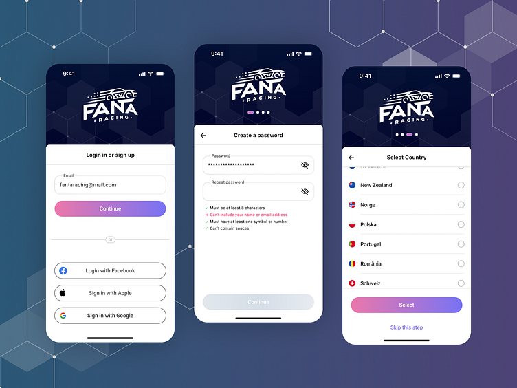
Fanta Racing Sign up flow
Hello everyone!
Today I want to share with you my work on the initial registration and login screens for a mobile app. These screens are crucial for the user experience since they are the first thing a user sees after downloading the app from the store.
Here are some key points to keep in mind when designing a registration or login screen:
Simplicity: The screens should be easy to understand and navigate. Avoid using too much text or complex forms.
Clarity: The purpose of each screen should be clear and concise. Use clear and concise language to communicate what the user needs to do.
Efficiency: The registration process should be as short as possible. Only ask for the information that is absolutely necessary.
Progression: Break the process down into logical steps. This will help users stay focused and avoid feeling overwhelmed.
