RENAISSANCE | LOGO DESIGN & BRAND IDENTITY
[Logo and Branding Project] Renaissance
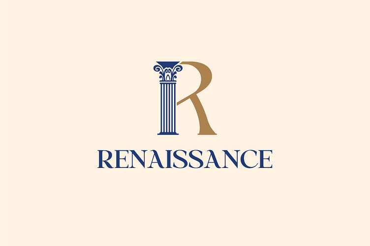
The logo for the construction and interior sector was designed by Kaiza to stylize the first letter of the brand name as a representative symbol: the letter R is specially stylized from the Corinthian column and the curved line symbolizes the curtains. The symbol developed from the first letter was designed by Kaiza, inspired by the cultural architectural art of the Renaissance, representing the bridge between classic and modernity, demonstrating the solidity and strength of the construction industry. The curves and kicks that create the letter R are designed to be soft and sophisticated, not too thick and not too thin, creating a curtain shape that symbolizes the interior of the house. The overall logo not only represents the brand's business field but also has special features that help easily identify the brand in the eyes of customers.
The logo color scheme using yellow and blue brings elegance and no less classic. Through the logo, Renaissance wants to convey the message about the beauty of the architecture and interior that brings to the house.
Designed by Kaiza
Copyright © Kaiza. All Right Reserved
Contact us:
KAIZA CO.,LTD
• P: 0889 996 399
• E: info@kaiza.vn
• W: www.kaiza.vn


