Salt. Brand Identity
Worth Our Salt
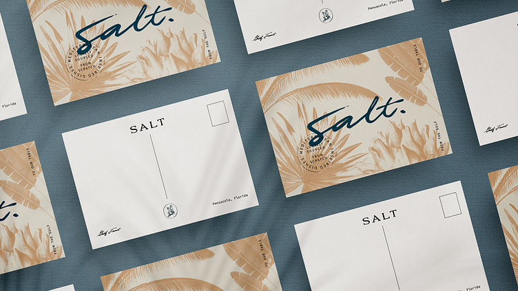
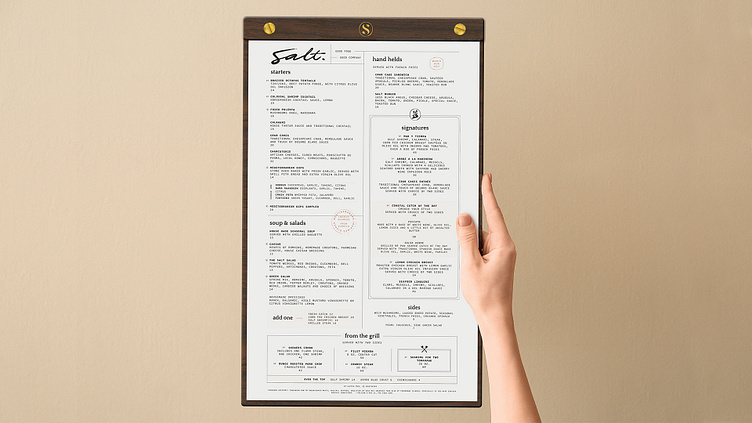
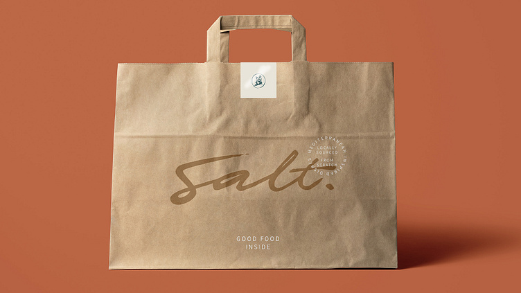
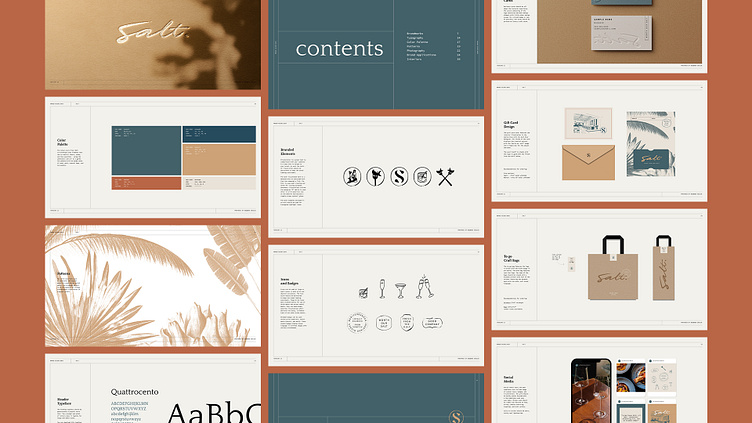
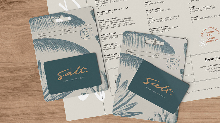
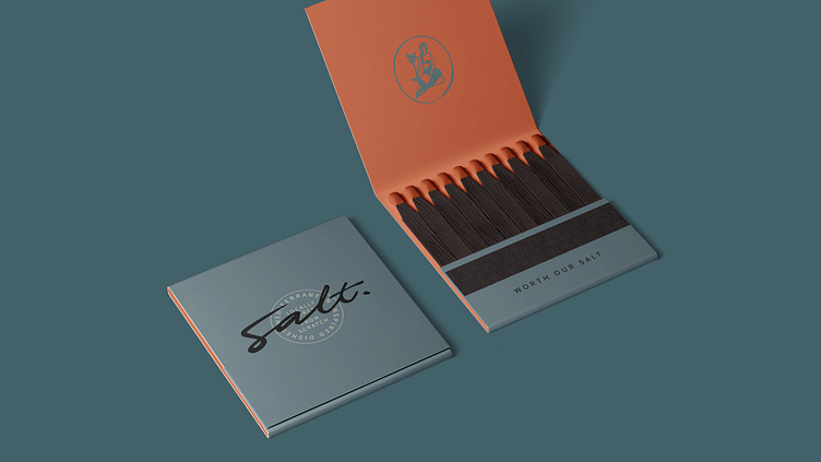
Salt needed a brand identity that felt authentic and approachable. The logo is refined yet casual with the use of a roughened hand-lettered logo that feels like a signature paired with a relaxed typeface for secondary graphic elements like custom badges and stamps. To bring in an element of whimsy, I created a hand-drawn illustration of a mermaid inspired from the mermaid’s symbolism of the bounty of the Gulf complete with a fork trident with a freshly caught fish. The patterns and colors used further exudes feelings of a relaxed coastline. I couldn’t let the opportunity pass to give this brand a punchy slogan that felt like a value statement, “Worth Our Salt.” Memorable and powerful.
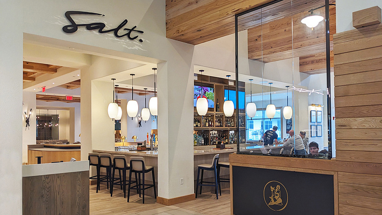
Salt offers a welcoming haven where people come together to enjoy fresh from the Gulf cuisine and share in the joy of good company. From the moment you step into its inviting space, you’ll feel transported to a world of warmth and relaxation. Whether you’re looking to catch up with friends over a casual lunch or celebrate a special occasion with a fine dining experience, Salt is the perfect setting for creating long-lasting memories with loved ones.