Sorveteria Itanhaém
Studio: Atobá Design
Client: Itanhaém ice cream shop
Sector: Food
Graphic design / Package design
Date: January/2022
With its main store located since 1969 in the traditional Praça da Independência, in the center of the Gonzaga neighborhood, Sorvetes Itanhaém has its own manufacturing and a menu with more than 40 flavors produced with noble ingredients. With this CV it is difficult to ask a person from Santos if they know Sorveteria Itanhaém without the question sounding like rhetoric!
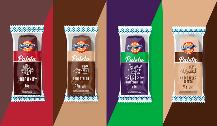
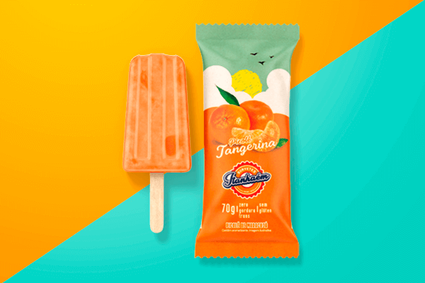
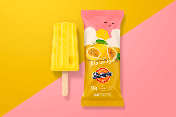
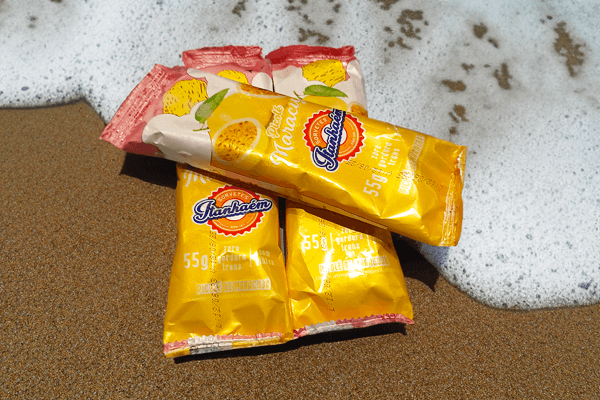
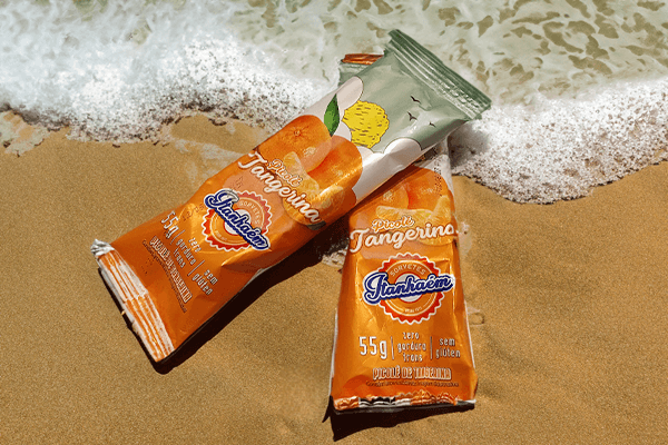
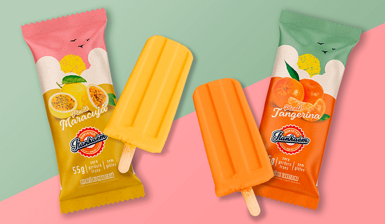
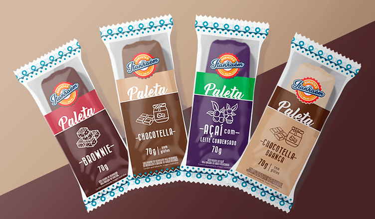
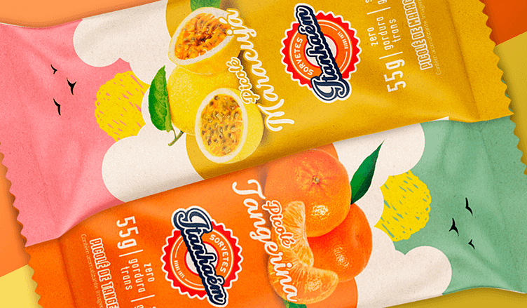
Atobá Design created the graphic design for the packaging of 6 new ice cream flavors. There are 2 new popsicle flavors, Tangerine and Passion Fruit, and 4 new palette flavors, Brownie, Açaí with Condensed Milk, Chocotella and White Chocotella. The packaging design follows the identity of the other flavors and aims to facilitate the identification of information and generate easy recognition of the brand and flavor.
6 ice cream packages were developed for Sorveteria Itanhaém, two of which were popsicles, one tangerine flavor and the other Passion Fruit flavor, and 4 palettes in the flavors Açaí with Condensed Milk, Brownie, Chocotella and White Chocotella. All were developed with a graphic pattern in mind with the potential to be used in new flavors, avoiding layout variations.
The central idea for the palettes was the use of icons that could convey the flavor of each product, drawn with a white outline, maintaining the color of the product.
The text was written in capital letters to highlight the flavor. The choice of typography also took into account the thickness of the palettes, which, as they are filled, are larger than popsicles. Each palette has two colors, designed to communicate flavor and differentiate one product from another on the shelf. A pattern was developed for the beginning and end of the packaging, which, on the front, has a hollow rectangle, facilitating visualization, product recognition and enhancing the desire for consumption.
The popsicles received an illustration in the background that represents summer, with colors that alternate according to the flavor of the product, creating a harmonious and inviting palette. The fruits were highlighted to facilitate recognition. The choice of handwritten typography results in the feeling of a popsicle produced with care and with a personal touch from the Ice Cream Shop.
In compliance with the new nutritional table rules, ingredient and consumption information was placed on the back of the packaging.