Um só rebanho, um só pastor
Studio: Atobá Design
Book title: Um só rebanho, um só pastor
Author: Maurício Zomignani
Graphic design / Editorial design
Date: September/2023
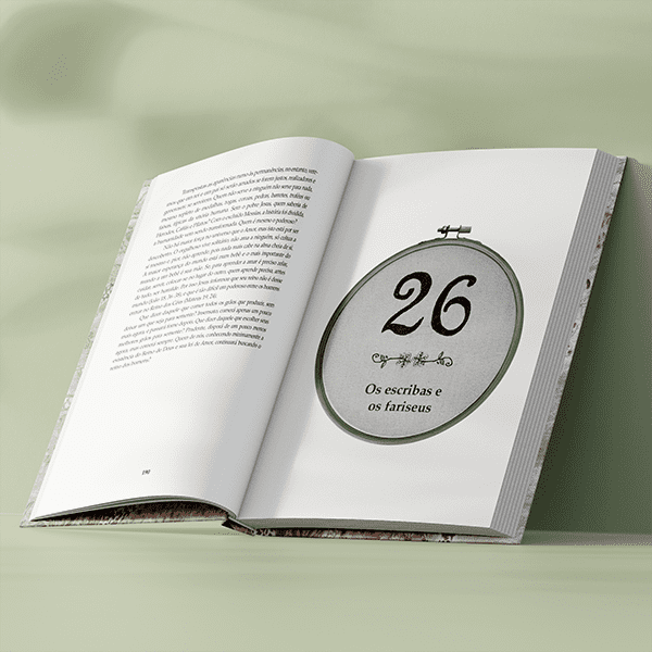
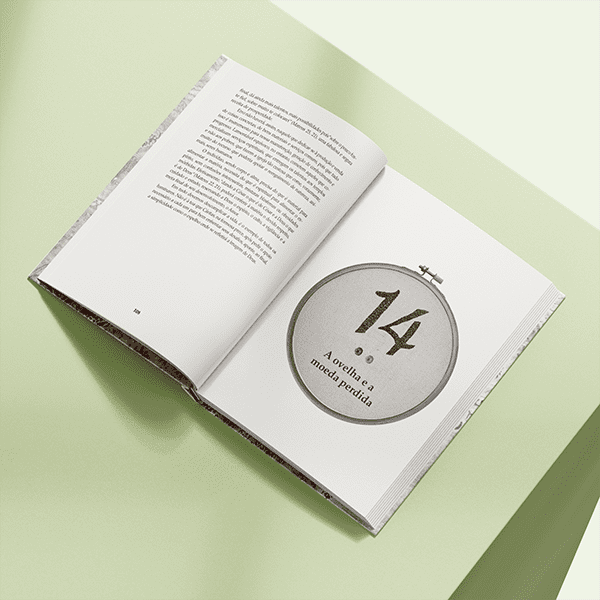
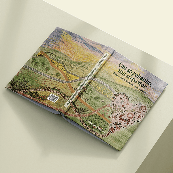
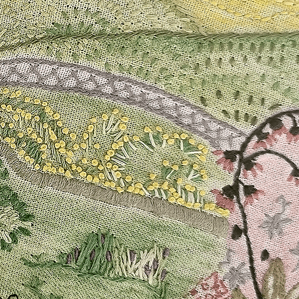
With the cover defined, the challenge was to maintain the reader's perception that the cover was an embroidery and edit the image so that it had a good impression. The layout needed to highlight the information in a harmonious way.
,
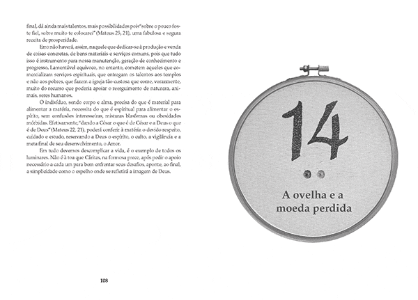
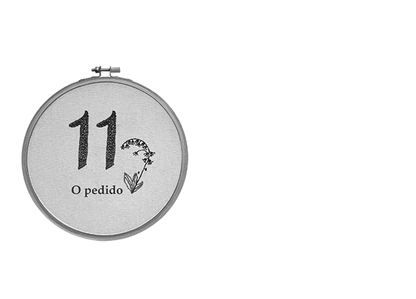
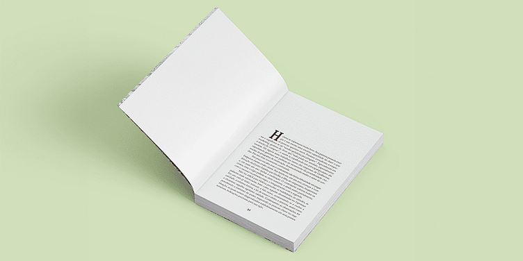
The Palatino typographic family was chosen for the layout of the text. Out of concern for the target audience, we increased the body of the text and leading to 10.5pt/15pt, facilitating readability and legibility. In the chapters, the image of a hoop was used and we edited it with the numbers embroidered on it. We use a 3-line cap at the beginning of each paragraph.
With the cover defined, the challenge was to maintain the reader's perception that the cover was an embroidery and edit the image so that it had a good impression. The layout needed to highlight the information in a harmonious way.
The Palatino typographic family was chosen for the layout of the text. Out of concern for the target audience, we increased the body of the text and leading to 10.5pt/15pt, facilitating readability and legibility.
In the chapters, the image of a hoop was used and we edited it with the numbers embroidered on it. We use a 3-line cap at the beginning of each paragraph.