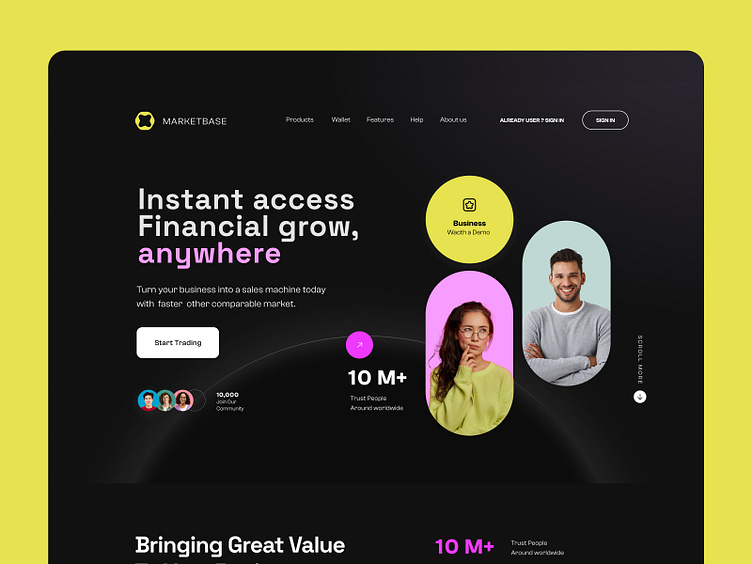
Financial Service - landing page
Hello Folks!🔥
Today I created an exploration for Financial Service Landing page called Marketbase
Well, I have to say that I used pink and yellow colors in this design, which I think is a very good combination. I also like the layout of the header sections and the use of people's images in circular and oval boxes. what do you think?
What do you think? Please let me know in the comment section!
Feel free to leave feedback and don't forget to press (L) and don't forget to follow
Contact us now !
Thank you for scrolling
I hope you will like the project ! Read our case study to learn more 🔥
✉️ Have a project idea? We are available for new projects at saeedyousefi@live.com | Send me a message
More by Saeed Yousefi View profile
Like


