Dashboard for SaaS platform
Objective
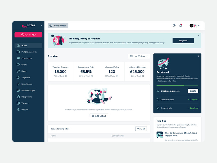
With the launch of our dashboard design's first phase, our aim was to empower users for efficient offer monitoring, insights, and impactful, data-driven decisions. This initiative addressed immediate user needs and seamlessly aligned with broader company goals of enhancing user engagement and fostering a data-driven culture. Beyond core functionalities, our redesign introduced KPI cards to distill complex data for a more digestible format, emphasising clarity on the home screen. The Help Hub, a newly conceived feature, strategically enhanced information accessibility for on-demand assistance, reinforcing our commitment to user support.
Moreover, a dedicated marketing space not only met analytical needs but also fulfilled the business objective of promoting feature discoverability. Importantly, this marks the initial dashboard iteration, symbolising the start of a dynamic evolution. Continuous testing and refinement, rooted in user feedback and evolving platform needs, are integral, ensuring the dashboard remains adaptive, responsive, and finely tuned to user expectations and business goals.
Created during my time @RevLifter — www.revlifter.com/
Research
The research phase commenced with a strategic blend of workshops and user interviews, aiming to precisely define the requirements for the dashboard redesign. Workshops were instrumental in aligning our goals with business needs and anticipating user preferences for swift information access. Collaborative sessions focused on pinpointing essential features crucial for users seeking a quick glimpse of information.
In workshops, we distilled key outcomes, identifying features deemed essential through a balance of business and user considerations. This involved prioritising features that not only met analytical needs but also aligned with broader business objectives.
Simultaneously, during user interviews, a mix of qualitative and quantitative data collection methods provided profound insights into user preferences, challenges, and behaviours. A comprehensive competitive analysis expanded our research, delving into industry trends, successful design patterns, and potential areas for innovation. Specific findings from the competitive analysis, such as prevalent design trends and successful implementations, directly influenced our design decisions.
This holistic approach ensured a thorough understanding of both user expectations and broader industry benchmarks. Guided by UX laws, including Hick's Law for streamlined information presentation and Fitts's Law for optimised button placement, our design decisions aimed to create a dashboard interface that is not only user-centric but also efficient and aligned with industry best practices.
Design process
Throughout the design process, we embraced a user-centric approach, initiating with low-fidelity wireframes to outline the structural layout and key elements of the dashboard. In addition to following Nielsen's Heuristics, we applied a range of design principles and UX/UI best practices to showcase a comprehensive understanding of design fundamentals. Ensuring visual hierarchy, consistent iconography, and a cohesive branded color scheme were key considerations, contributing to an interface that is not only aesthetically pleasing but also intuitively navigable.
Challenges faced during the wireframing and prototyping stages were met with strategic solutions. One notable challenge was optimising the dashboard for various screen sizes. By employing responsive design principles and conducting extensive testing across different devices, we ensured a seamless user experience regardless of the screen dimensions.
The incorporation of Gestalt principles further enhanced the design, allowing users to naturally organise and interpret information. Interactive prototypes, developed using Figma, played a crucial role in visualising the user journey and gathering valuable feedback through usability testing. This iterative process enabled us to address usability issues promptly, ensuring that the final design not only met but exceeded user expectations, contributing to overall user satisfaction.
Results
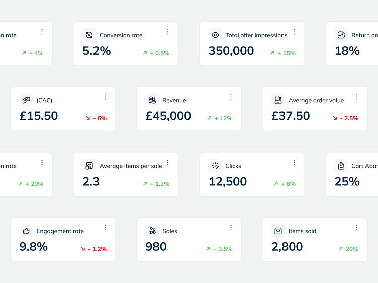
In the wake of implementation, the inaugural release of the dashboard marked a significant leap forward, providing users with swift access to crucial information at a glance. User engagement metrics exhibited a notable upswing, indicative of heightened usability and increased user satisfaction. It's essential to note that, as the first iteration, these results are derived from the initial release, and continuous testing and improvement are integral parts of our roadmap.
The application of UX laws and heuristics played a pivotal role in crafting an interface conducive to rapid data analysis and informed decision-making. Despite the absence of a direct comparison with a previous version, user feedback strongly echoed the success of the redesign. Users commended the clarity of information presentation and the ease of extracting insights, reinforcing the design's effectiveness in meeting user needs and aligning seamlessly with the platform's objectives. These positive outcomes set a robust foundation for ongoing evolution and refinement of the dashboard.
Next steps and final thoughts
As we move forward, the next phase involves a meticulous analysis of user analytics, emphasising specific aspects of the dashboard's performance and the integration of new features. This scrutiny will encompass metrics such as user engagement, click-through rates, and time spent on different sections, guiding targeted enhancements.
Simultaneously, A/B testing will be central, systematically comparing variations to identify areas for further refinement, providing quantitative insights into user preferences. Concurrently, the deployment of targeted surveys will capture qualitative feedback on usability, feature preferences, and overall satisfaction. This comprehensive approach ensures that both quantitative and qualitative data will shape the next phases of design iterations.
In conclusion, our dashboard redesign has achieved heightened usability, increased user satisfaction, and alignment with overarching business goals. The introduction of KPI cards, Help Hub, and a marketing space showcased versatility. Looking ahead, a continuous focus on analytics, A/B testing, and user feedback guarantees ongoing evolution, maintaining a user-centric, adaptive, and effective dashboard. This project exemplifies the dynamic synergy between design principles, user needs, and business objectives.
Thank you for stopping by.
Have a project? Let's work together — kaseyelliott.co.uk
