Credit Card Check Out Form - Design Challenge #2
Title: La Belle Secure Checkout – A Seamless E-Commerce Experience
Introduction: In the bustling world of e-commerce, the checkout process is not just a transaction but an essential part of the customer experience. "La Belle Secure Checkout" is a UI/UX project designed in Figma to revolutionize how customers conclude their shopping journey—balancing aesthetics, functionality, and security.
Project Background: La Belle, a burgeoning online cosmetics retailer, approached us to address a critical challenge—shopping cart abandonment. The task was to design an intuitive and trustworthy checkout interface that reduces friction and encourages completion of purchase.
Objective: Our primary goal was to enhance user satisfaction and conversion rates through a streamlined and secure checkout process, tailored for La Belle's diverse clientele.
Design Process:
Research: We embarked on a journey to understand the nuances of online shopping behavior through surveys and user testing. We analyzed patterns and identified pain points in existing checkout flows, particularly the need for clarity and speed.
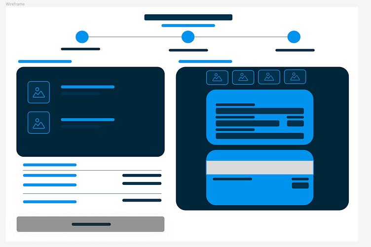
Wireframes: The initial wireframes served as the blueprint for our design. We focused on simplifying the layout to prioritize ease of navigation, ensuring that essential elements like order summary and payment options were front and center.
User Flow: Each step of the user's journey was meticulously plotted to ensure a logical and frictionless progression from cart to confirmation.
Visual Design:
Colors and Typography: Our color palette choice—a blend of indigo, magenta, and turquoise—was inspired by La Belle's brand identity, signifying elegance and trust. The typography, Vioada Libra, and Abel were selected for their readability and modern flair.
Mockups: The high-fidelity mockups depict the culmination of our design process. We incorporated user feedback to refine the visual hierarchy, ensuring that the CTA buttons were prominently displayed and the payment information was easy to input.
Interactivity: Interactive elements, like form field validation and toggle views for card information, were integrated to create an engaging and reassuring checkout experience.
Final Product:
The Checkout Interface: Our final design presents a harmonious blend of functionality and aesthetics. We introduced a three-step checkout process—address confirmation, payment, and review—each clearly delineated for user convenience.
Responsiveness: The design was rigorously tested across devices, ensuring responsiveness and consistency in the user experience.
Reflection and Learnings:
Challenges Overcome: Adapting to the varied needs of La Belle's demographic was a challenge, met through adaptive design strategies and iterative testing.
Outcomes: Post-launch, La Belle reported a significant reduction in cart abandonment and a positive uptick in customer feedback, validating our design's effectiveness.
Learnings: This project reinforced the value of empathy in design—understanding the user is paramount. It also highlighted the power of iterative design and feedback in creating successful digital solutions.
Tools Used:
Figma for wireframing and UI design
Adobe Photoshop for image editing
Canva for additional graphic elements
Conclusion: "La Belle Secure Checkout" stands as a testament to user-centered design's impact on e-commerce success. It showcases the synergy between visual appeal and usability, all while maintaining the highest security standards.


