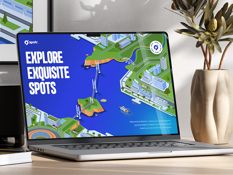
Spotr: Landing Page Highlights 📸
Spotr App
Let's take a look at Spotr landing page highlights! ✨
We've created a fully illustrated header to captivate our audience's attention. The features of the application are explained concisely on this landing page to help users gain information quickly. We're using Spotr's main branding color, blue, to create a cohesive brand identity. 🤩
The main sections of this landing page include featured spots, app features, a preview of our community space, and a call-to-action to download the app. 🤳
Check out our Behance post for this project here!
See the full page below 👇
More by Orely View profile
Like


