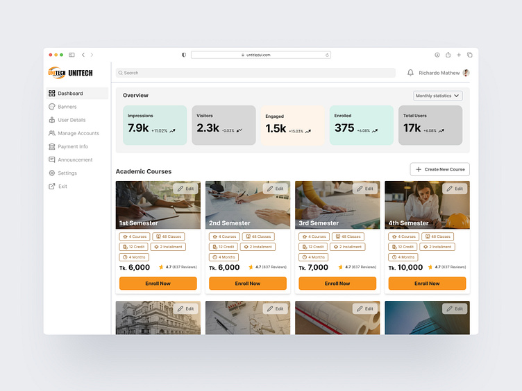
Dashboard Design for Unitech
Overall impression: The UX of the website is clean and simple, with a focus on functionality. The dashboard is easy to navigate and provides users with an at-a-glance overview of their important metrics.
Information hierarchy: The information hierarchy is clear and concise. The most important information, such as user details and monthly statistics, is placed front and center. Less important information, such as account settings, is tucked away in the sidebar.
User flow: The user flow is straightforward. Users can easily find the information they need and complete tasks without getting lost. For example, users can click on a user to see their detailed information, or click on a course to enroll in it.
Calls to action: The calls to action are clear and persuasive. The "Enroll Now" buttons are prominently displayed and encourage users to take action.
Overall impression: The UX of the dashboard is clear and concise, with a focus on providing quick access to key information and actions. The use of white space and a grid-based layout makes it easy to scan and find what you need.
Information hierarchy: Information is prioritized based on importance. The most important information, such as the title “A Beautiful Title” and the user’s name “Richardo Mathew”, is placed at the top of the page. Less important information, such as account settings and announcements, is placed lower down or to the side.
User flow: The user flow seems straightforward. Users can navigate to different sections of the dashboard using the menu on the left-hand side. Key actions, such as uploading banners and editing account details, are available as buttons or links.
Navigation: The navigation menu on the left-hand side provides access to all the main sections of the dashboard, including “Banners,” “User Details,” “Payment Info,” and “Settings.” The menu is clear and easy to use, even for first-time users.
Calls to action: There are a few calls to action on the dashboard, but they could be made more prominent. For example, the “Update Banners” button is a bit small and inconspicuous.
Enter yoIf you love the design concept follow me and appreciate it.
I'm available for a new project!
Get in touch!
Facebook: https://www.facebook.com/alimrankhandesign/
twitter: https://twitter.com/AlImranKha11612
LinkedIn: https://www.linkedin.com/in/al-imran-khan-715596216/
or alimrankhan599@gmail.comur text here...


