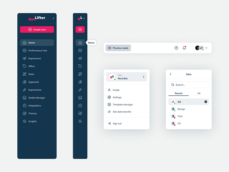
Sidebar navigation & fly-out menus for SaaS platform
Objective
In redesigning our SaaS platform's sidebar and fly-out menus, our goal was to overcome challenges posed by the original bulky and overwhelming design. The cluttered interface hindered user experience, prompting a strategic overhaul during the information architecture phase. Our focus was on creating a more intuitive and user-friendly menu structure, including a key feature — the collapse/expand function — providing users control over their menu display. This redesign aimed not only to enhance navigation but also to improve overall user experience by simplifying complexity, increasing accessibility, and aligning with our business goals for sustained growth and user satisfaction.
Created during my time @RevLifter — www.revlifter.com/
Research
Through collaborative efforts, we conducted qualitative in-house user interviews to deeply understand user frustrations and workflows within the existing menu structure. Despite the challenge of quantifying exact interview numbers, our focus on quality interactions unveiled nuanced user needs. Common themes emerged, including difficulty in navigating the bulky menu and challenges related to information overload. Simultaneously, competitive analysis of industry leaders guided our design decisions, ensuring our menu structure met user expectations and positioned itself as an industry leader by addressing prevalent issues and aligning with emerging trends.
Design process
In redesigning the SaaS platform's sidebar and fly-out menus, our approach was rooted in exploring effective navigation solutions. Drawing inspiration from industry leaders, we implemented UX laws and UI best practices in wireframing and prototyping. Low-fidelity wireframes focused on simplifying and adhering to design principles, leveraging laws like Hick's Law for efficient choices. The transition to interactive prototypes in Figma, guided by principles such as the Law of Proximity, ensured logical grouping. Additionally, the use of recognised UI best practices, including clear visual hierarchy and consistent iconography, contributed to an interface that was both intuitive and aesthetically pleasing.
Incorporating user feedback during testing, we iteratively refined prototypes, emphasising both aesthetics and functionality. This iterative design process laid the groundwork for a user-friendly interface that surpassed expectations, establishing a robust foundation for the SaaS platform's initial stage.
Results
Post-implementation, our redesign of the SaaS platform's sidebar navigation and fly-out menus led to a substantial 15% increase in user interactions. This boost can be attributed to key design improvements, notably the introduction of a collapsible/expandable menu function, providing users with greater control over menu customisation. Streamlining the information architecture through user interviews and testing contributed to improved usability, making navigation more intuitive. Direct user feedback emphasised the positive impact, with statements like "The collapsible menu is neat" and "I can find info much quicker now.
Next steps and final thoughts
In summary, the menu redesign achieved a notable 15% increase in user interactions, validating key improvements like the collapsible/expandable menu function.
Moving ahead, we'll analyse user analytics, focusing on metrics like click-through rates and time spent on the menu. A/B testing will compare different design variations quantitatively, while targeted surveys will gather qualitative insights. These combined findings will guide iterative refinements.
Thank you for stopping by.
Have a project? Let's work together — kaseyelliott.co.uk


