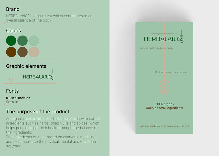
Brand identity for an organic tea product with flat mockup
As studying more font types and brand typography, I created a brand identity for a fictional tea business, which sells products that can rebalance the body.
I wanted to start with the logo, which is simple, a combination between herbal and balance and the graphic end part of it suggests the main important things for this product: the basic ingredients: herbs and what this tea does: it brings balance and health.
From this logo, I wanted to use 2 types of fonts: one modern, simple but with circular, smooth, flow-like shapes (MuseoModerno) and one that is more sophisticated, that can establish the idea, after the softness of the first font (Cormorant). MuseoModerno is good for the logo and for the idea of flexibility and balance, and Cormorant has more contrast but also it is delicate. The first contrast of them is one is Sans Serif, the other is Serif. The contrast is exactly the idea of complementary, like the tea: soft, ease, warm, sweet but also spicy, grounding-like, herbal, strong. As a similarity of the fonts, both have well defined rounded and short letters.
The colors are very suggestive: the soft green is from herbs, nature, green tea and the brown is earthy, spicy, strong, the idea that this tea is fresh but also can ground you.
