Monarch Place Brand Identity
This branding project for Monarch Place is a re-brand of the existing logo, and then creating a matching brand of their new transition house. The goal was to create a brand that kept many of the same elements, but went through a re-design to include custom script lettering, a custom butterfly logo and individual colour palettes for each transition home.
Monarch Place, the flagship transition home has been operating for decades, giving women and children a chance to live safely and in freedom away from abuse as they heal. The mission of Monarch Place has changed the lives of so many women and children, and we wanted to celebrate the joy of new beginnings.
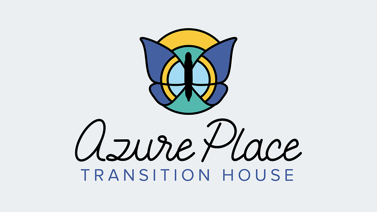
The script lettering is all customized, keeping legibility in mind and creating a long-lasting brand. The butterfly icon is also created to mirror freedom, movement, with suns and rays surrounding the butterfly to capture safety and warmth.
The Azure Place logo kept the same elements, but has been assigned its own cooler colour palette to reflect the Azure butterfly and to help the branding feel connected to Monarch while having its distinct look.


