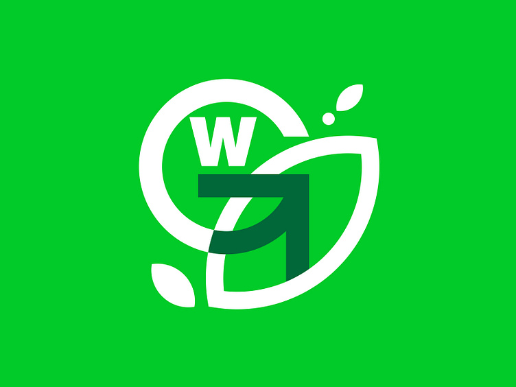
G-World — Ecology project logo. Green Epic Project Brand
I might make a video about how and where I created this logo. But only if someone is going to watch it. The logo was made while sitting in the forest and other inconvenient places for design. But it's just another placeholder that should illustrate which colors and how best suit a brand loyal to ecology.
Seriously, the simplest way and the color associated with ecology is green.
The simplest shape is the leaf form.
The letter "G" closely resembles the recycling symbol or a rotating arrow.
"G-World" is a silly name for the project, so it's hidden in the visual hierarchy
in the background.
Keep looking at the world with a broader perspective.
More by independencecreations View profile
Like


