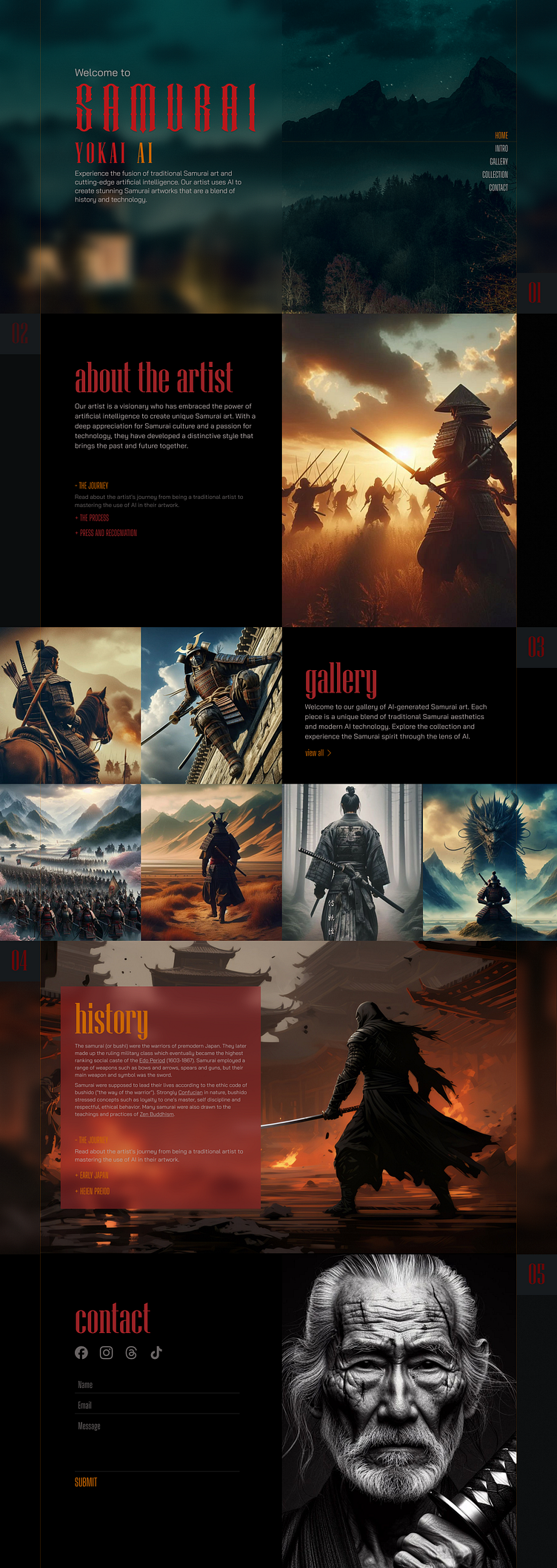
Digital Artist portfolio - Samurai Yokai
Image formation details
I arranged these images on the page using the golden ratio and the golden grid principles. These create a harmonious and balanced layout that attracts and retains the user's attention. I also considered the direction of the images, so that they guide the user's eye movement and keep them engaged.
Images by Samurai Yokai via Instagramhttps://www.instagram.com/samurai_yokai_ai/
Get this template from FREE https://www.figma.com/community/file/1333396808424034503/free-website-template-design-samurai-yokai
Thank you for watching
If you like what you see, don't forget the press the ❤️ icon and follow 👍🏼me at Dribbble and Behance.
--
I am Ashhad Khan, UI/UX designer with 10+ years of experience in creating user-friendly and beautiful interfaces for websites and webapps.
I have a strong portfolio of projects that demonstrate my skills in UI design, UX research, and user feedback.
Dribbble - https://dribbble.com/ashhad1
Behance - https://www.behance.net/ashhad1
Frontend Developed - https://projects.ashhad.com/

