Cherry LA | CRO
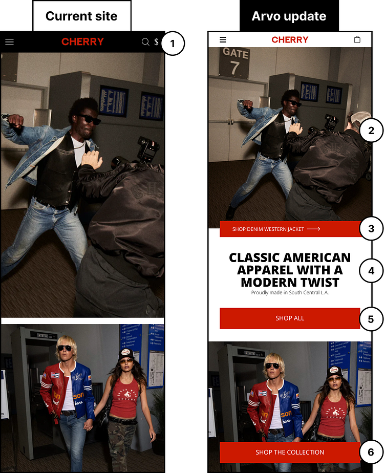
We really love the style of Cherry Los Angeles and so we designed a mockup explaining 6 tests we'd test to increase the overall conversions:
1) Don’t overcomplicate the header by introducing icons that may not be intuitive to the user. Instead, opt for familiar icons that are quickly recognizable so that they can intuitively get the information that they are looking for.
2) Your images do a great job of pulling people in, but let’s shorten the scrolling for the user by shortening up the image and allowing for some of the others above the fold.
3) Add a secondary CTA that will take them to the product that is featured on the hero image. Directing interested users to the actual product page increases chances of conversion!
4) There is no headline present to communicate what or who Cherry LA is. Provide a headline that states what goods you are selling and what sets you apart from competitors.
5) Give users a clear CTA to click on to get them into your purchasing funnel. Providing clear direction for a user to take will equate to higher conversions.
6) Make it easy by ensuring key action buttons are full-width on mobile and towards the bottom of the fold as users can miss click on buttons that are not intuitive and designed well.
