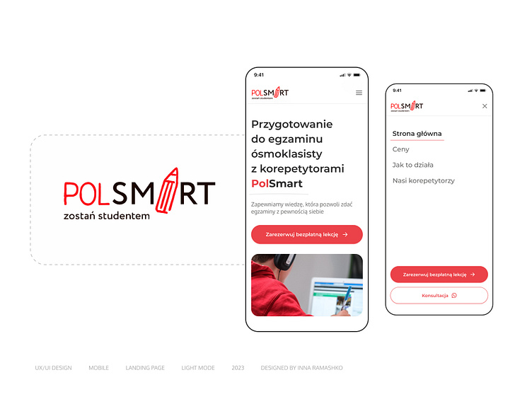
Mobile landing page. PolSmart
Design for a Mobile landing page 1/6
About
PolSmart is a unique online platform that provides students with the opportunity for quality learning with teachers in an online format.
The audience comprises students of various ages, and for maximum effectiveness, individual landing pages have been created that offer precise information tailored to the needs of each age group.
The objective of the project was to develop the design for a landing page specifically geared towards preparing students for 8th-grade exams.
First banner
PolSmart's confidence in the service provided is reflected in the opportunity to attend the first lecture for free. To ensure that this chance is not missed, a "Sign up for a free lecture" button has been added to the main banner. Additionally, for user convenience, this button, along with the contact button, is always accessible in the menu.
Full Case Study on Behance
Like it? Appreciate it!
