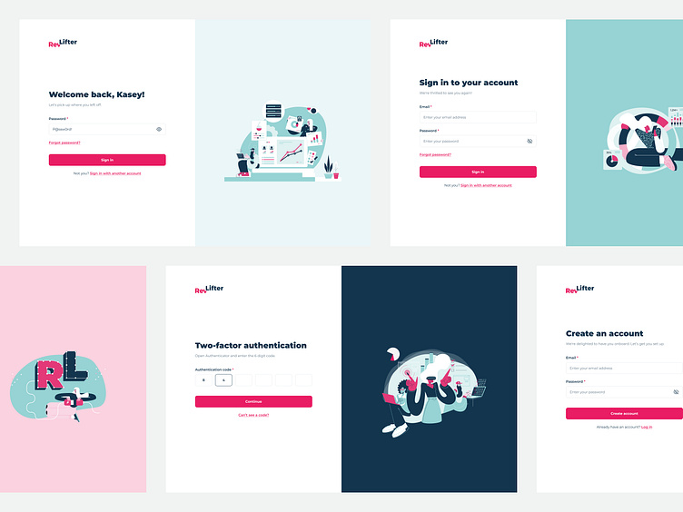
Login/create account pages for SaaS platform
Overview
In response to previous user pain points and to improve overall user experience, we revamped the login and account creation screens for our SaaS platform.
Focused on simplicity and user convenience, the redesign addresses challenges such as high bounce rates and user confusion. With easy-to-follow instructions and a sleek layout, the updated design ensures a seamless experience, prioritising hassle-free access for users.
Created during my time @RevLifter — www.revlifter.com/
Before & after design
Objective
The primary objective of crafting a simplistic login page for our new SaaS platform goes beyond just creating an easy entry point. It is intricately linked with our broader business goals and user-centric approach. By prioritising simplicity, our aim was to not only reduce friction and enhance user accessibility but also to establish an immediate and positive connection with the platform. This streamlined design is a strategic move to align with user preferences, ensuring a seamless onboarding experience. The objective is to go beyond quick access — it's about leaving users with a lasting positive impression, enticing them to explore the platform further, and setting the stage for long-term engagement and satisfaction.
Research
User Interviews
Conducted a series of in-house user interviews, engaging with a diverse pool of participants to gather insights into their expectations for the new platform, ensuring a robust understanding of user needs. These discussions delved into common pain points users typically encounter with other applications or competitors' flows, shedding light on their preferences. Key findings from these interviews played a pivotal role in shaping our design decisions, directly influencing the creation of a login and account creation experience tailored to user expectations.
Competitive Analysis
Conducted a thorough analysis of competitors' login and account creation processes to identify industry best practices and areas for differentiation. The focus was on synthesising these findings to contribute valuable insights, playing a key role in shaping a user-friendly and distinctive login/account creation experience for our new SaaS platform.
Design process
Wireframes
To establish a solid foundation, we crafted low-fidelity wireframes employing essential design principles such as clear visual hierarchy and intuitive layout. The focus was on simplifying complexity and ensuring an aesthetically pleasing yet functional design for the login/account creation pages.
Prototypes
Utilising Figma, we translated wireframes into interactive prototypes, implementing recognised UI best practices like consistent iconography and the Law of Proximity for logical grouping. This stage aimed not only to visualise the user experience but also to gather valuable feedback, ensuring that our design aligns seamlessly with user expectations.
Usability testing
Realising the importance of user-centric design, we conducted usability testing, engaging real users to identify pain points and areas of improvement. This iterative feedback loop was instrumental in refining the user experience, ensuring that our design resonates effectively with the target audience.
Iterative Design
Given that this SaaS platform is in its inaugural stage, this login and account creation page represents the foundational iteration. As the initial design for this critical entry point, it sets the groundwork for user interactions, laying the foundation for future refinements and improvements.
Results
Following the initial release, we observed a commendable 20% reduction in bounce rates, indicative of an enhanced onboarding experience. It's crucial to note that these results are derived from the initial deployment, emphasising the iterative nature of our design approach. Complemented by affirmative user feedback, these outcomes lay a robust foundation for continuous testing and improvement.friendly SaaS platform.
Conclusion
The inaugural development phase has yielded significant successes, evidenced by a marked decrease in bounce rates and positive user sentiments. The key takeaway from this project is the substantial impact of design improvements on user engagement and satisfaction. As we propel forward, these achievements serve as both a validation of our current efforts and motivation to persistently refine and elevate the user experience.
Next steps
Our trajectory involves a proactive stance, with regular workshops planned to scrutinise every facet for iterative refinement. This multifaceted approach ensures that our design not only adapts to evolving needs but also remains a frontrunner in delivering seamless user experiences.
Thank you for stopping by.
Have a project? Let's work together — kaseyelliott.co.uk


