ĐẤT VIỆT ELITE | LOGO DESIGN & BRAND IDENTITY
[Logo and Branding Project] Đất Việt Elite
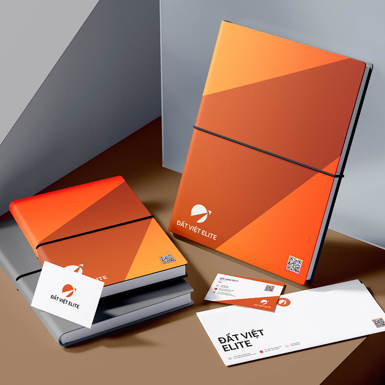
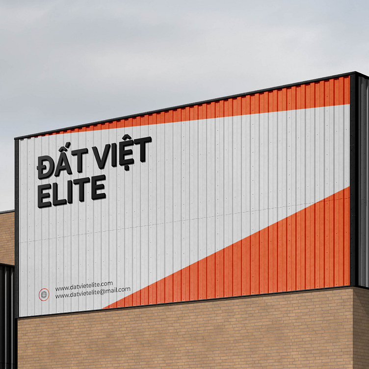
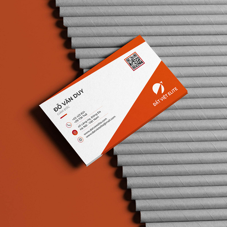
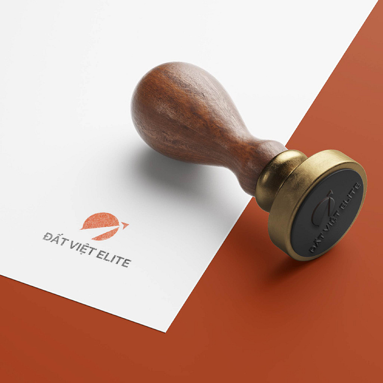
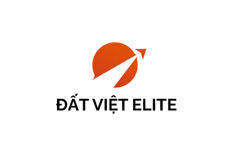
Kaiza took design inspiration from the image of a wheel to build a brand image that clearly represents Dat Viet Elite's business field. The wheel-shaped symbol designed with an upward arrow represents the ambition to develop, explore a new era and convey the message of sustainable development in the future. The total color of the red-orange logo creates a feeling of strong energy, vitality and determination. The overall logo is impressive and attractive to viewers.
Designed by Kaiza
Copyright © Kaiza. All Right Reserved
Contact us:
KAIZA CO.,LTD
• P: 0889 996 399
• E: info@kaiza.vn
• W: www.kaiza.vn