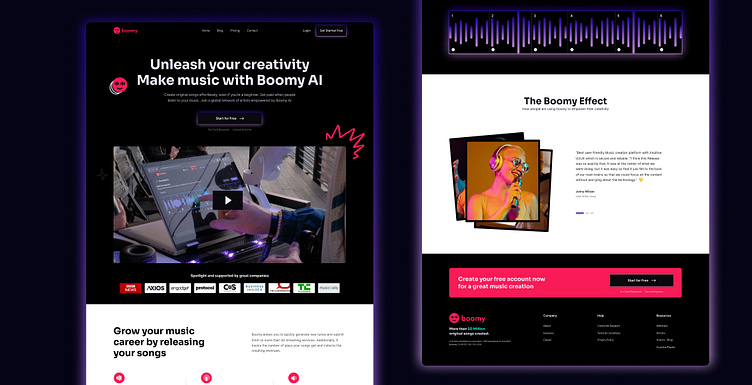
Boomy - New Onboarding Dashboard
Client: Boomy (Take Home Assignment)
Industry: SaaS
Date: Nov 2023
Location: 🇺🇸 USA
Tools: Figma
Link to Project: View Live Site
Unlocking Creativity, Unmasking User Friction
Making music with Boomy's AI should be a dream, not a struggle. But some parts of the experience needed a tune-up to truly unlock user creativity. We stepped in, analyzing the journey from beginner to hitmaker and tackling the roadblocks to musical expression.
Mission
Uncork the magic of Boomy by:
Identifying UX friction: Through comprehensive UX audits, we pinpointed pain points impacting user flow and enjoyment.
Competitive analysis: We studied rival platforms to understand market trends and user expectations.
New Design System: We envisioned a flexible, clear system reflecting the AI revolution at Boomy's core.
Easy-to-follow Process: We streamlined the user journey, simplifying navigation and showcasing capabilities transparently.
Results
Landing Page Reimagined: We transformed the landing page into a captivating, informative launchpad for musical adventures.
Onboarding Redefined: We separated onboarding from the main experience, ensuring a focused and engaging introduction.
Dashboard Demystified: We designed a comprehensive, user-friendly dashboard, putting all options and resources at the artist's fingertips.
The Outcome? A great improvement. Smooth onboarding welcomes new users, the intuitive dashboard empowers music-making, and the revamped landing page attracts a broader audience. Boomy's creative spirit can now truly sing, thanks to a seamless user experience that inspires and delights.


