Photoshop Projects (Summer 2023 MDC)
Line Project
I choose the "South Florida Miss Juneteenth" pageant as one of the events to create a poster for. To ensure a sense of facial structure and definition, a variety of line density was made to highlight the natural beauty of a young pageant contestant. A double split complimentary color scheme was used to differentiate the shadows implied in the design.
"Blow Fish At The Wharf" was the second event used to create a poster for. The concept of the design was to have a wharf/beach shore area filled with various inflatables typically found at the beach or pool. The double split complementary scheme highlighted the concept with the split between land and sea. While also providing a sense of physical form made with the diverse lines.
Greeting Cards
The design concept for Denki Kaminari's birthday card was centered on his personality. He's quirky, outgoing, fun, and the personification of summer fun. The card had to reflect all those personality traits with the pops of color and selected images to provide the sense of innocent, fun and young, water park birthday party.
"Villain Gala" is a response to the 2023 Met Gala theme: "Karl Lagerfled: A Line of Beauty." The idea was to bring together fictional villains that are considered hideous, rejects even, to society and have them "take over" the Met Gala and make a statement on beauty being more than a physical quality. Each villain selected are powerful in their own universe, allowing them to be powerful enough to change the The Met Museum and the Gala for what it stands for.
Dream House
"Sweet Dreams" is a collection of deconstructed desserts. The foundation of the house is based on s'mores; a chocolate house, marshmallow yard, and a graham cracker picket fence. The exterior and interior decor was designed by strawberries and creme; strawberry bushed, condensed milk curtains, and whipped cream roofs. The Kit-Kats were the only structure of the house that was not deconstructed.
The design for "Sleepy Forest" came from the idea of combining the feeling of watching nostalgic movies and being in a safe space of comfort. "The Neverending Story" and "Spirited Away" were the main sources of inspiration for the forest location and the various plushies that were used for the dream house.
Underwater Project
For the first underwater scene, three standard sized sardines where transformed into three distinct fresh water fish. The liquify filter was applied to make these transformations, and color overlays were applied, to differentiate each fish. The same technique was applied to the grass.
For the second underwater scene, five standard sized yellow goldfish were transformed into different salt water fish. The liquify filter and color overlays were applied to create the transformations, in order to create the distinct fish. The liquify filter was also applied to the background, and well as the burn and dodge tool on the items used to create this chaotic scene.
Zoo Poster
The concept for this poster was to entice an audience to visit Zoo Miami to see the Asian Small-Clawed Otters. The otters' native habitat is in the marshlands, as their source of food thrives in the marshes. The text on the path was designed to imitate both a ripple in the water and follow the horizon line between the vegetation and the sky.
The design for the ostrich poster for Zoo Miami was based on the old sticker books that the zoo would give to every child when their entrance tickets were bought. The bold stroke and composition of the ostriches added to the sticker book idea.
The theme for the Dyeing Poison Dart Frog was horror, as the name alone indicates how dangerous this frog can be when an animal or human comes into contact with them. The color scheme and font was intended to reflect old horror movie posters, especially in the use of drop-shadows for the text.
Gallery Project
In the 305 MIA Gallery, I learned how to use the vanishing point filter to apply the framed art onto the Bacardi Building. As well as placing the gallery title and information on an angle following the same angles of the building.
In "The Art of Volleyball" Gallery, I edited and place distinct screenshots of a volleyball anime show to show the intensity and beauty the volleyball has to offer. The statues added to the beauty that volleyball as a sport is.
Bezold Effect
The concept of this bezold effect design was to use the character Natsu Dragneel (a dragon slayer) and his "source of power" (fire) to represent his abilities in the anime "Fairy Tail." The design concept connects with the other two dragon slayers and their source of powers.
The concept was to use Wendy Marvell (a dragon slayer) and her "source of power" (sky) to represent her abilities. The cloud is used to represent the sky.
The concept was to use Gajeel Redfox (a dragon slayer) and his "source of power" (iron) to represent his abilities. Rather than using the element of iron, the figure inside Gajeel is Metalicana, who is his foster father and the dragon of iron.
No. 1 Hero VS. No. 1 Villain
Similar to the Fairy Tail bezold concepts, "No. 1 Hero vs. No. 1 Villain" is designed to highlight the main hero and villain that starts the plot for the anime "My Hero Academia." The bezold effect highlights the villain in lime and the hero in his blue hero costume color.
Polly Project
For this polygon technique travel poster, I decided to focus on the native plant of Hawaii: the plumeria. The use of the polygon technique helped simplify while intensifying the colors of the plumeria flower.
Similar to the Hawaii travel poster, I focused on the native animal of Australia: the koala bear. The polygon technique helped simplify and soften the colors of the sleeping koala bear to give it a softer, more friendlier appearance.
GIF Project
For this gif project, a standard solid color gif was intended for the design for "Family Day." The outer strokers were different in color to purposely create a strobing effect, to draw the eye towards the center image.
The colors were selected from a photographed strawberry that had a sky backdrop. The burnt orange background was intended to give a harvest vibe to the gif.
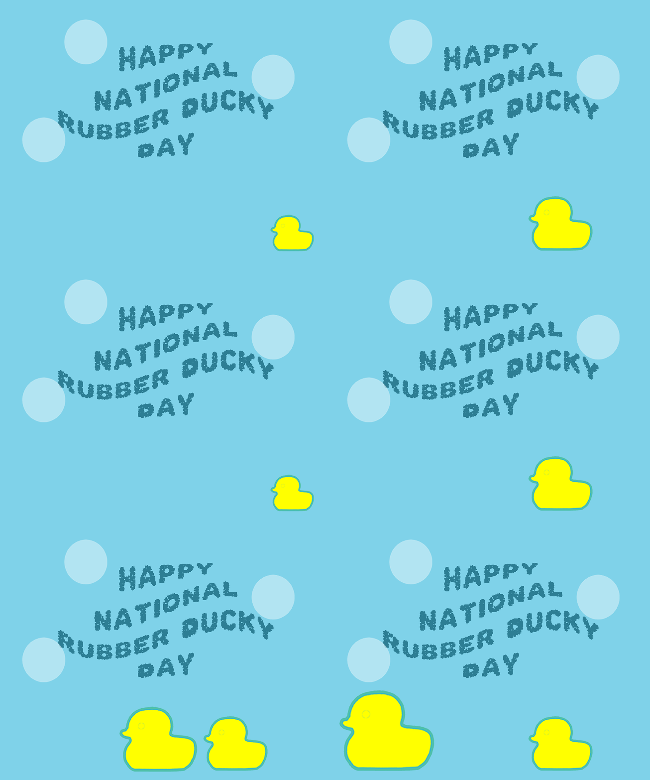
The outer stroke is the same color to show that it's the same rubber duck that is moving across the gif but in different sizes to give the appearance that it's getting closer to the view.
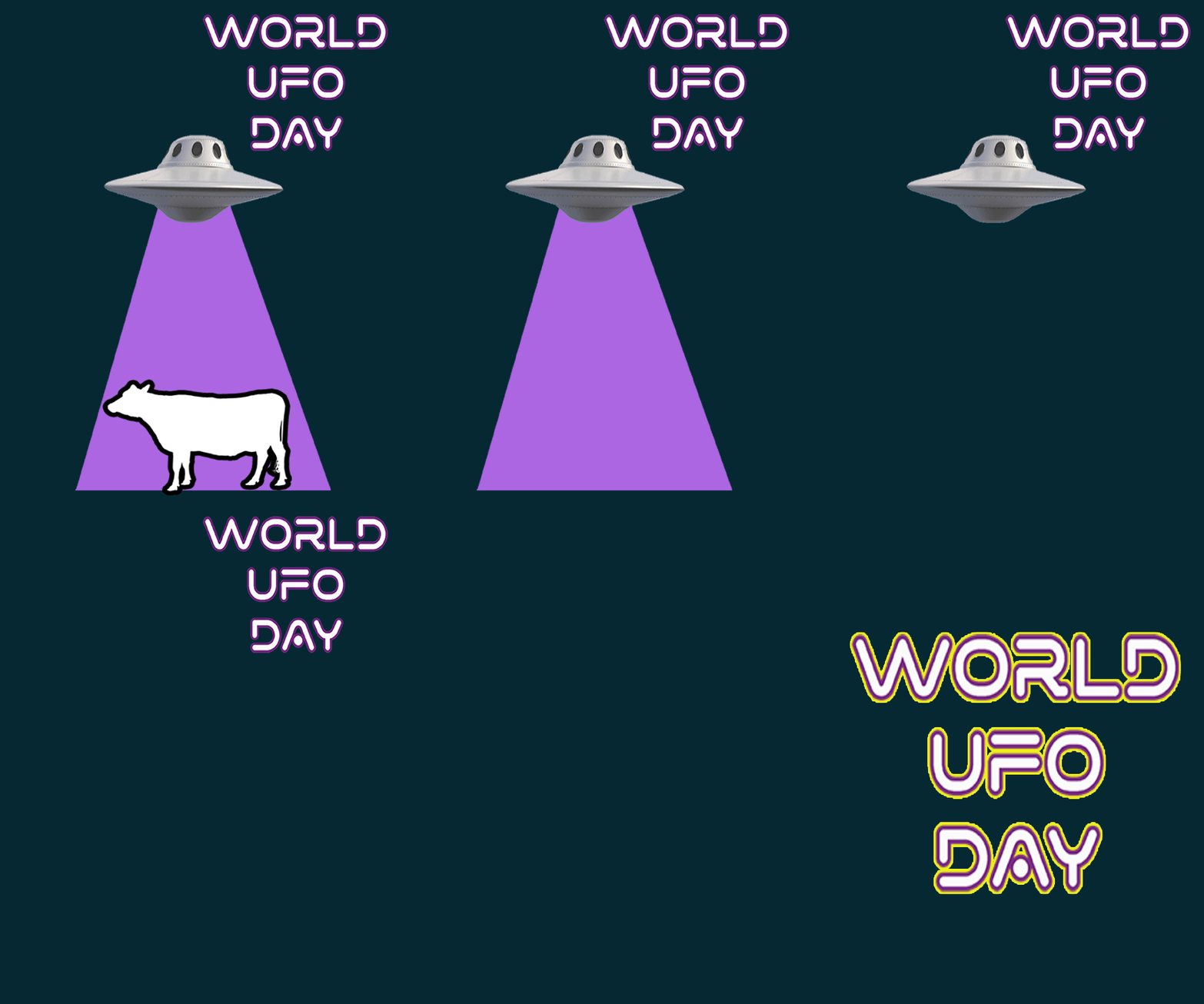
The outer stroke used on the cow was intended to draw the viewer's attention to the cow as it disappears into the ufo.
Narrative Animation
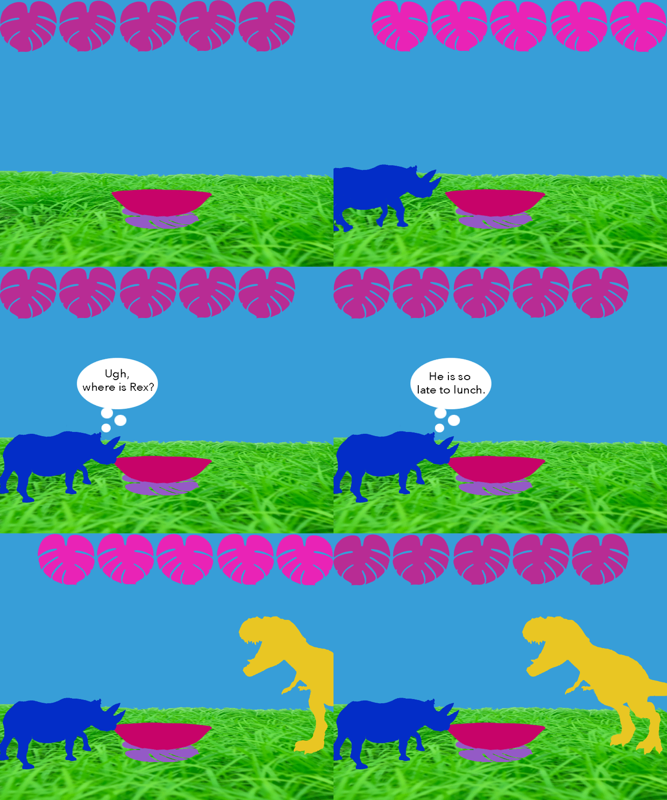
This narrative animation is about a rhino and a t-rex having lunch together but the t-rex was late because he couldn't see his watch. Obviously the t-rex couldn't see his watch because of his short arms but the rhino forgot at the moment.
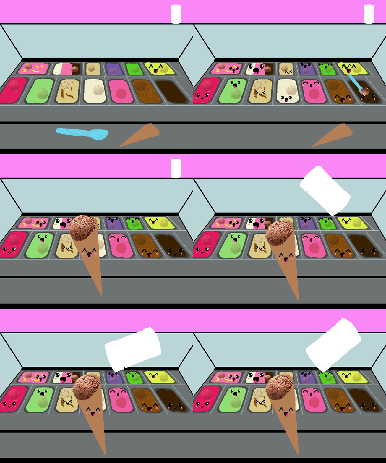
This narrative animation is about a chocolate ice cream being scooped into a waffle cone and being covered in sprinkles. Over 30 animation frames were used to create this short animation.
This narrative animation is simply about the life cycle of an apple. Starting from an apple seed and ultimately ending with an apple seed.
Slice Project
The "Peaches" album cover was solely inspired by the song "Peaches" written and sung by Jack Black in "The Super Mario Bros." movie released over the summer of 2023. The green heart represents Bowser and his love for Princess Peach and the pink heart is for Princess Peach, who in Bowser's mind and heart will love him back.


