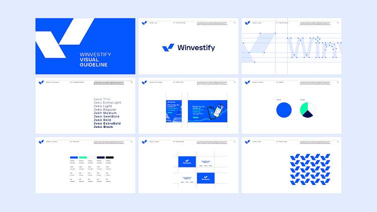
Winvestify Visual Guideline
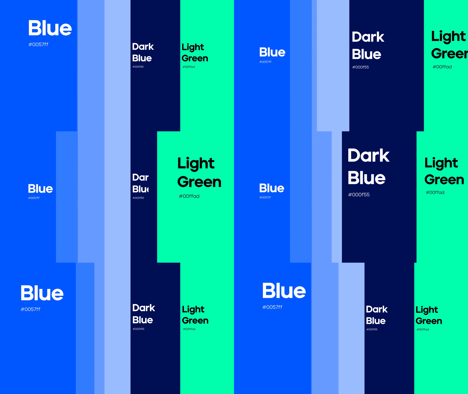
Winvestify's visual identity is a testament to simplicity, reliability, and trust. The harmonious blue palette speaks to our commitment to well-being, while the geometric sans font signifies a straightforward and accessible investing experience.
This intentional blend creates a visually appealing brand that invites individuals to explore a personalized and empowering journey in the world of investing.
Winvestify's visual identity is not just about aesthetics; it's a promise of clarity and prosperity in every financial endeavor.
Let's work together!
— Do you have a project? 📩 info@overoverdesign.com
More by Over&Over Design Studio View profile
Like


