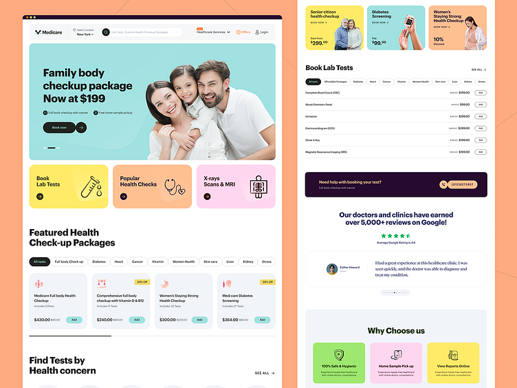
Medical Lab Testing Booking Landing Page
Studies show that over 67% of healthcare websites fail to attract patients, despite looking great.
That's because patients don't want to waste time browsing pretty websites.
If your website is too hard to use because of unnecessary elements, patients will get frustrated and LEAVE.
We've created a solution with our Medicare website's checkup booking landing page concept!
This will help you:
Reduce your churn rate
Boost your ranking on search engines
Get more patients
Why will it work?
We didn't give up on design, we just made it more user-friendly. Our streamlined features and easy-to-navigate layout make it easy for patients to find what they need and book an appointment in seconds.
Mockup Preview 💻
Schedule a 30-minute free UX consultation call with one of our business experts. No sales pitch, only value:
☎️ 👉🏼 Calendly.com
Full Preview🚀
We appreciate your interest, Dribbblers! 😍
Schedule a call at ☎️ 👉🏼 Calendly.com
Let's talk about your project..
✉️ hello@musemind.agency
Website 🌐musemind.agency
Explore Our Design Case Study Featuring ➡️ Behance
Let's Check Our Others Dribbble Profile
musemind saas • musemind mobile • musemind branding
Follow us to see more exciting shots and insights on
Linkedin I Instagram I Twitter I Medium I Facebook I Webflow I WhatsApp


