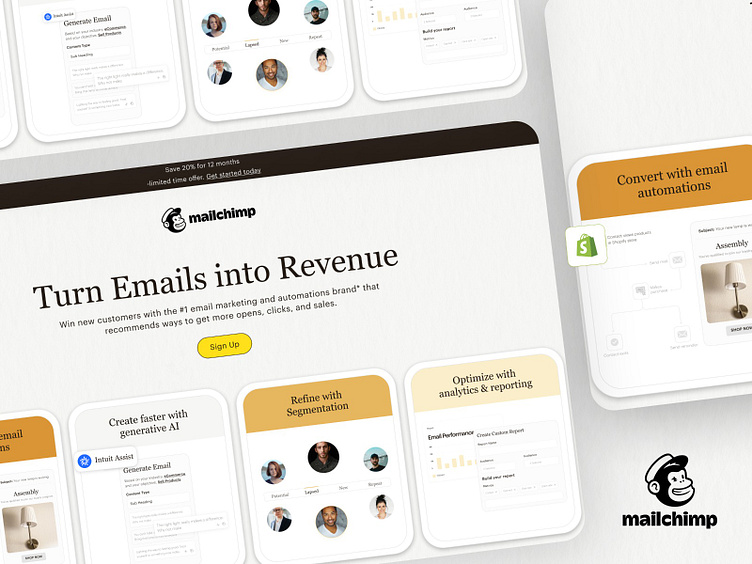
MailChimp Redesign
Follow us on 📺 Instagram | LinkedIn | Behance
Mailchimp: Redesign UX for Effortless Email Marketing
Project Background: Mailchimp is a powerhouse in email marketing, but its interface could benefit from a refresh to enhance user experience (UX) and empower users to achieve their goals faster. This redesign tackles usability pain points and injects a touch of modern delight.
Key UX Improvements:
• Streamlined Onboarding: Ditch the lengthy signup process for a quick and painless one-pager, capturing essential details while maintaining engagement with playful micro-animations.
• Intuitive Campaign Creation: Ditch the overwhelming dashboard for a focused "Campaign Canvas" where users can drag-and-drop pre-built layouts, integrate content blocks, and personalize with a click.
• Real-time Performance Insights: Ditch the static reports for dynamic, actionable dashboards that offer visual cues and actionable recommendations based on campaign data.
Impact:
This redesign aims to make Mailchimp even more accessible and empowering for users of all skill levels, turning email marketing from a chore into a creative and rewarding experience. It focuses on intuitive UI, frictionless workflows, and actionable insights, ultimately boosting user engagement and campaign success.
What insane idea do you have? 😎
You can reach us at Hi@mastercreationz.com or Biz.mastercreationz@gmail.com


