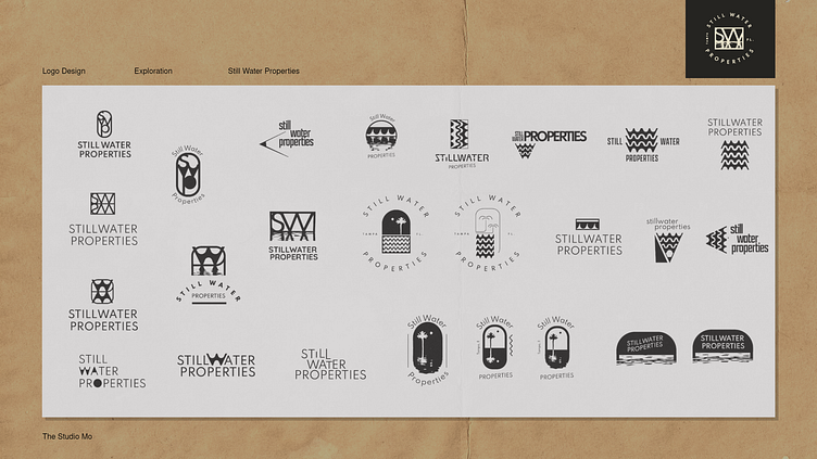
Still Water Properties Logo Exploration & Visual Branding
The initial exploration was geared around three words, each with their own combinations of creative direction: Inky. Florida. Reflection. The "W" quickly became of interest when examining the letters as their own formations, it's peaks and valleys easily crafting itself into waves. The clunkyness of the letters was also bold, brave, and picks up on the Seminole vibes of Tampa Florida.
But we couldn't help but bring our focus continually back to the dynamic movements of the "SW" monogram. With it's strong boxing encasing the abstract ripples of the reflection, it proved to be versatile as we further explored logotype, label logos, and emblems for the full font package and delivery.
More by The Studio Mo View profile
Like

