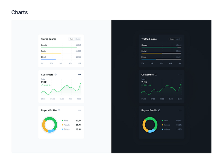
Dark Mode | Charts
Hello Dribbblers 🏀
In the dynamic realm of application design, the decision between a light and dark mode extends beyond visual appeal, significantly impacting user experience and functionality. Nowhere is this duality more impactful than in the realm of dashboards, where information clarity, user engagement, and visual comfort intertwine. The decision to incorporate both light and dark themes within applications, especially dashboards, is a strategic one, driven by considerations that extend far beyond personal preferences.
--
Press "L" if you enjoy it. ❤️
Stay tuned for more updates! 🙌
Feel free to share your thoughts below. Cheers!
---
You can read my article on creating a "What is a Design System, its features and benefits."
----
Get in touch with me:
Behance | LinkedIn | Instagram
📩 Reach me at: linc.effect@gmail.com
