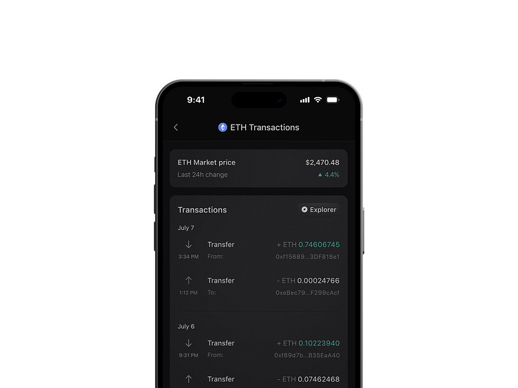
Transfer history
Got a new app on my device yesterday and ended up redesigning it a bit. It bugged me how hard it was to scan the content so tried improving readability / scannability. And yeah, got a bit carried away with the visuals too 🤷♂️
BTW, replacing green with your brand's primary (here - 🔵) is not a great idea. If the whole western world* operates in 🔴/🟢 paradigm you really don't want to make YOUR branding the priority and challenge my mental models...
* Yeah, you could argue that e.g. in China red is used for positive/trend up and green for negative/trend down, but that's a different conversation, localization conversation...
Below preview with the original screen and layout and my attempt to improve it.
Happy to hear some feedback!
More by Peter Grochowski View profile
Like

