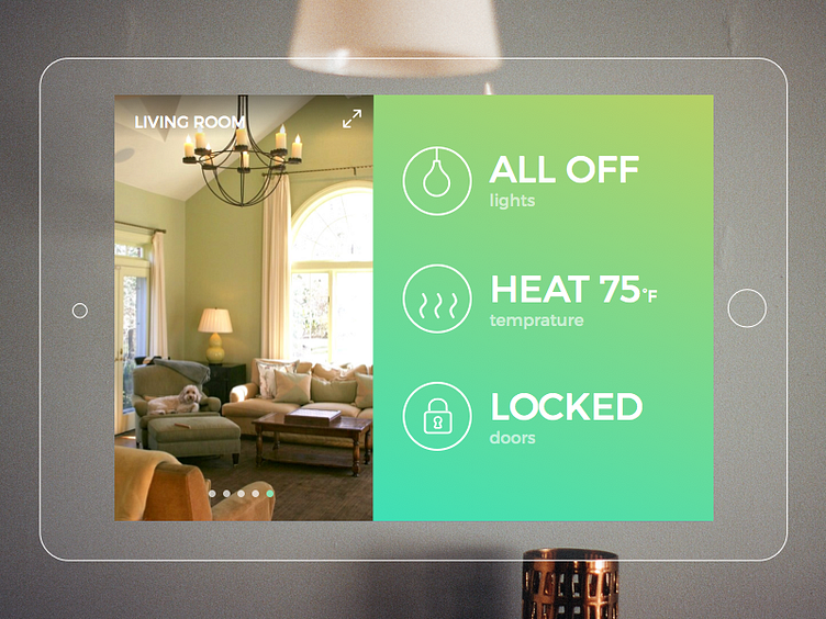
Home Monitoring Dashboard
Problem: A user wants to have a overview of the state of their house on their home monitoring devices. They are sometimes attached to walls, which can be at any height and make it harder to read and tap.
Solution: Unless there's a problem, a user wouldn't want to drill into anything and play around with a home monitoring device. The device should display most important info front and center with blocky letters and over-sized icon for easy reading from a distance without the user doing anything.
Photo from Houzz Icons by Sergey Demushkin, Creative Stall & ▲▲▲
More by Yi Ren View profile
Like
