AntiSocial Brand Refresh
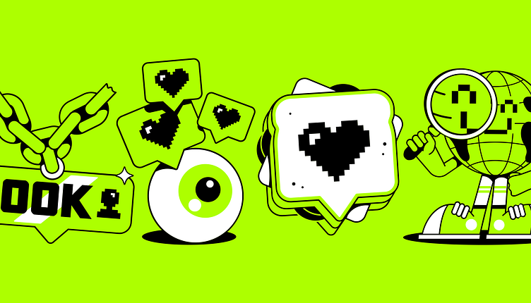
AntiSocial’s brand identity didn’t authentically reflect the agency’s energy, creativity, or its bold and ambitious mission — to help brands meet their consumers where their culture happens. Looking to make the same impact in the industry as it does for its clients, AntiSocial needed a new brand that was flexible, relevant and absolutely fresh. Taking inspiration from 90s MTV culture, the vintage digital typeface acts as a nod to the OG days of the internet and the bold neon green is the loudest on the market. The playfully pixelated design system eschews traditional branding rules in favour of constant play, allowing the brand to bend and change to match the ever changing trends of the online landscape.
More by Ryan Booth View profile
Like


