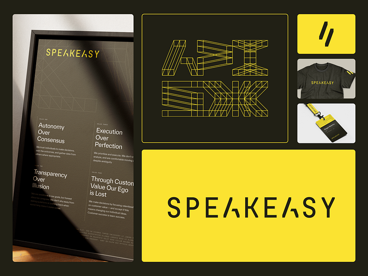
Speakeasy Brand Identity
Speakeasy is accelerating innovation by making it easy for developers to create or consume any API.
APIs facilitate communication between two software components, which is often the initial stage for development. Speakeasy allows a single builder to harness the talent and work of hundreds in a couple lines of code with support through high-quality software development kits, API tooling, and developer tools. With their previous visual identity, Speakeasy was severely limited.
There were inconsistencies between their tone and visuals, and the brand was built on a bright and playful color palette that didn't really match who they are and what they offer. Brand elements were well-designed, but they lacked strategy, or at least a consistent conceptual narrative.
Head to the case study for the full scoop.
---
Looking for a brand agency? We would love to hear from you.
Email us: hello@odibrand.agency
Our Website / Instagram / LinkedIn / Twitter
