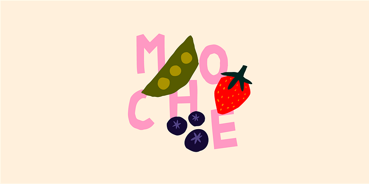
MOCHE - Branding
MOCHE is a fictional brand. It was founded by two former food workers, Léane and Maxence, to fight against food waste. The brand name is a french word that can be translated as 'Ugly' in reference to its goal: give a new life to neglected fruits and vegetables 🥬 🥕 🍓 🍎
To do this, they collect ugly or poorly graded fruits and vegetables from supermarkets on a daily basis, and resell them at attractive prices, in the form of baskets and via an online Click and Collect system.
I used humor as a strong brand identity, with two puns "Fièr·es d'être MOCHE" ('Proud to be Ugly') and "Cultivons la différence" ('Let's Cultivate Difference' - in French, the verb "Cultiver" can mean both grow and nurture).
My color scheme is fun and dynamic, with a lot of greens and some bright colors, and I chose a "paper cut" typography to recall the imperfections of the fruits and vegetables. I also created some illustrations in a similar spirit to use as a pattern and as assets for Instagram.
List of deliverables: Brand Graphic Identity, Posters and some visuals for Social Media.
- Brief provided by WeBrief.
Thank you for watching! ☺︎
My Instagram ✦ My Portfolio ✦ All my links
Work with me: louise.prdn@gmail.com

