Manfrotto
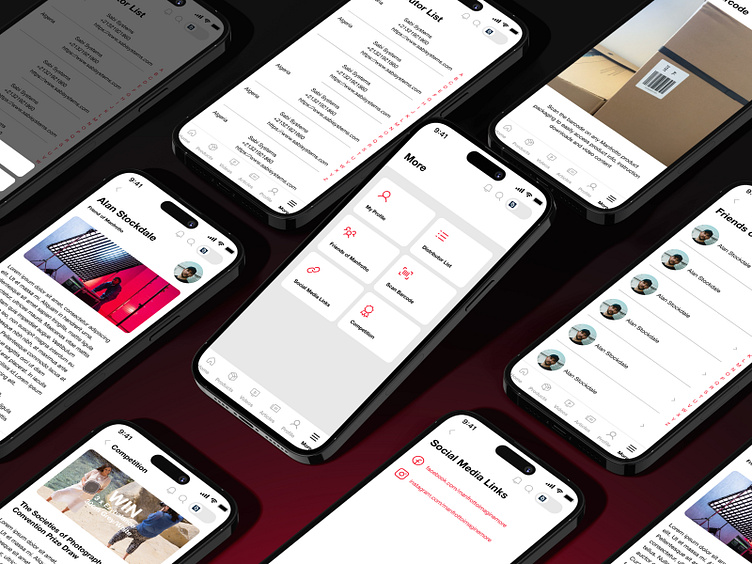
KIJO created a UI which adhered to the latest standards of modern app design. We included up-to-date features like whitespace, micro interactions, typography, components, and improved the micro copy.
The previous app made use of very heavy colours like red backgrounds which contributed to that out-of-date feel. We flipped this up and used the Manfrotto brand colour as an ascent instead. This felt more subtle and intentional, as this meant the red was then being utilised for important action buttons and calls to action. Visit more of our work here: https://kijo.co.uk/work/
More by KIJO View profile
Like


