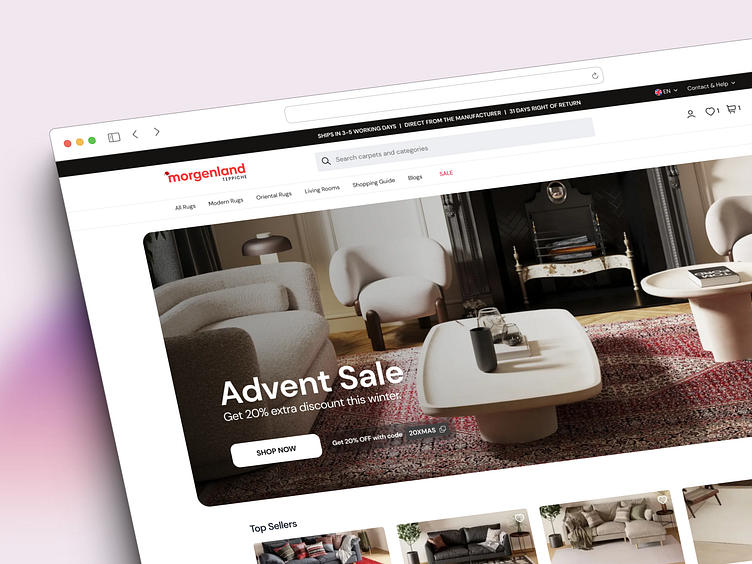
E-Commerce Design for Morgenland
I took the lead on redesigning the user interface and overall experience for Morgenland-Teppiche, a well-known German e-commerce site with a hefty monthly user base of over 250,000. My work was all about giving the site a major facelift and making sure everything from browsing to buying was smooth and user-friendly. Here's a bit of what I got into:
Tidying up the Site: I jazzed up the site to make it super easy for users to find and fall in love with products, focusing on a clean, attractive layout.
Boosting Sales: Tweaked the site design here and there to turn more browsers into buyers, all based on what the numbers and trends were telling us.
Smoothing Out the Checkout: Worked on making the checkout process a breeze, because no one likes a headache when they’re about to buy something cool.
Emails that Pop: Designed eye-catching and click-worthy email templates for those marketing messages and order updates.
Team Play with Marketing: Teamed up with the marketing folks to ensure the site's vibe was in tune with our ads and promos, tying the whole shopping experience together nicely.


