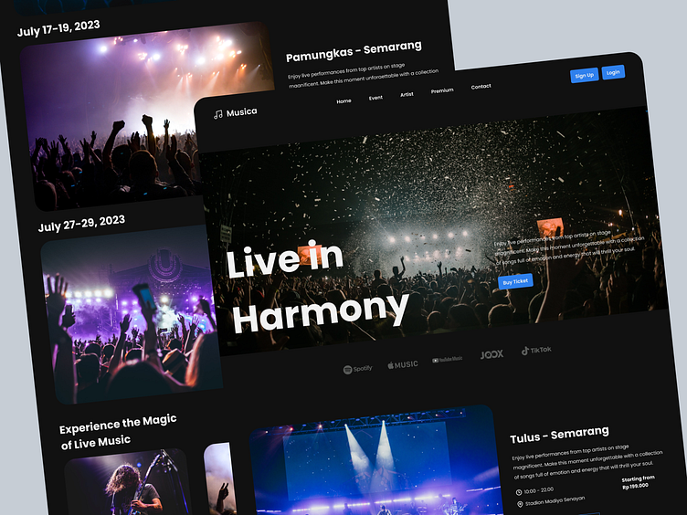
Landing Page - Musica
Musica is a website that aims to collect donations for musicians and artists. This website is designed with the User-centered Design (UCD) approach, which focuses on the needs and desires of users.
User-centered design
Musica website design is designed to be easy to use and understand by users. It looks clean and structured, with a focus on important content.
Efficient features
Musica website is equipped with various effective features in gathering donations.
Analysis
Musica website design that is user-centered and efficient can help this website achieve its goal, which is to collect donations for musicians and artists. Its clean and structured appearance makes it easy for users to find the information they need. Effective features also help users easily and quickly donations.
Conclusion
Musica website design is an example of a user-centered and efficient design. This website can be an inspiration for other designers who want to create websites that are easy to use and effective in achieving their goals.
Design Guideline 🎨
Thank you for exploring! 🙌
I hope you enjoy it! Your feedback is highly appreciated. Don't hesitate to share your thoughts. Don't forget to hit the like button ❤️. Thank you! Cheers! ✨
---
Open for job opportunities:
Let's connect: elraztaqillah@gmail.com
- - - - - - - - - -
Explore our work:


