Veja | CRO

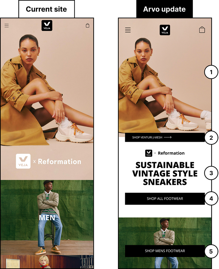
We recently designed a mockup explaining 5 tests we'd run for VEJA to increase their overall conversions:
1) Provide clarity so that users can understand both the image and the message by separating the two. Doing so will create impact for your customers.
2) Give users a direction by adding a secondary CTA which will take them to the product that is featured on the hero image. Directing interested users to the actual product page increases the chances of conversion!
3) The headline offers no clear communication for the user. Instead, try language that will tell customers what the product is and utilize a subheading for collection-specific details like collaborations or other benefits.
4) Make user engagement easy by ensuring key action buttons are full-width on mobile.
5) Direct users to take specific actions to the collection pages with buttons that are clearly labeled. Giving interested users directional prompts will help them get to their destination quicker and without any unnecessary frustrations along the way.