Bliss Gown | CRO
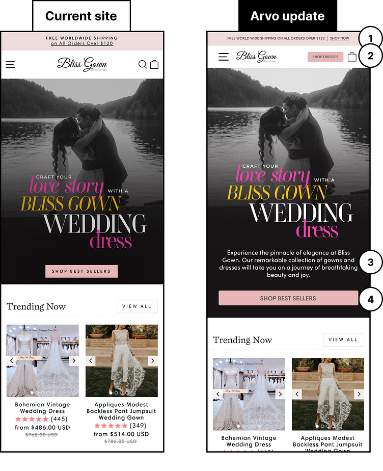
We recently designed a mockup explaining 4 tests we'd run for Bliss Gown to increase their overall conversions:
1) Make sure the announcement bar provides a CTA link so that users can take the desired action quickly.
2) Clean up the header by nesting the search function in the hamburger menu. Also, add a main call to action that will be present for users to quickly access your goods.
3) Add a brief company statement that lets new users know who you are and what they can expect from your website.
4) Ensure buttons are easy to identify by making sure that they are full-width on mobile.
More by Justin Doyle View profile
Like
