Cakemail App Redesign
My Role
I was tasked with bringing quality-of-life changes to users and simplifying the dev/design handoff by rethinking the app's design patterns. I worked out simpler ways for users to find their stuff, made the design bits quicker to build, and proposed ways to add CDP features to Cakemail's product offering.
✅ Simplify design system
✅ Improve app structure
✅ Bring more value to users
Tools & Tech
Figma
Google Material
PostHog
In the latest product update, I moved our design system over to Figma and aligned our component library with Google Material for a cohesive and snappy UX.
I also poked around PostHog, an open-source Customer Data Platform, to understand how their tech could be incorporated into the app and bring value to Cakemail users.

Leaner Design System
In redesigning Cakemail's component library, I focused on refining an overly complex design system that was filled with too many, sometimes unused, component variations. By simplifying the library, I not only ensured development would be more efficient, but that the delta between what was designed and what was built was smaller from jump, and easier to shrink down from iteration to iteration.
👇
Data-Centric UX/UI
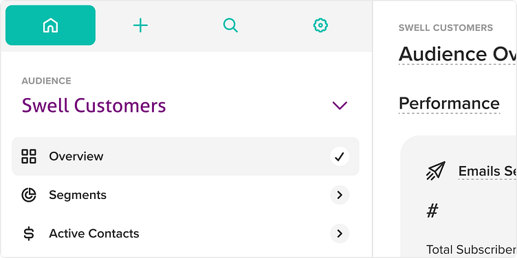
Side-Nav
With all the proposed features coming to the app, it was necessary to explore a new idea for the sub-nav system. A vertical-scroll side-nav not only provides the room I need to organize user assets and data, but also makes better use of the limited screen height by replacing a clunky header with user content.
👇
Action Dock
Within the side-nav I introduced four main tabs that prioritize the actions users may want to take: Manage, Create, Search, and Settings. This consistent pattern, repeated across all main sections like Campaigns and Audience, not only simplifies navigation but also reinforces user behaviour. By encountering the same layout in different areas, users quickly learn where things are and how to get stuff done within the app, making their experience smoother and more efficient.
👇
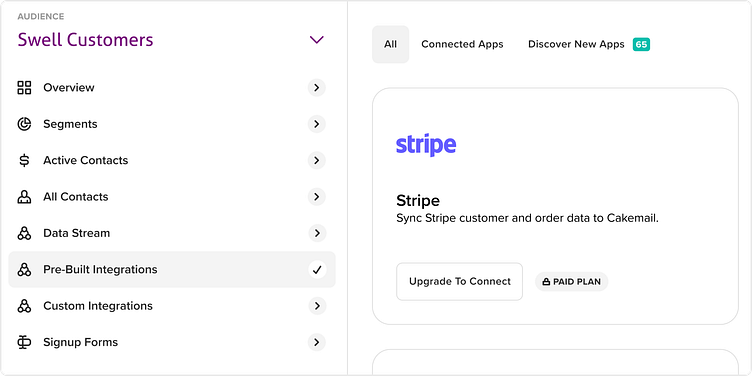
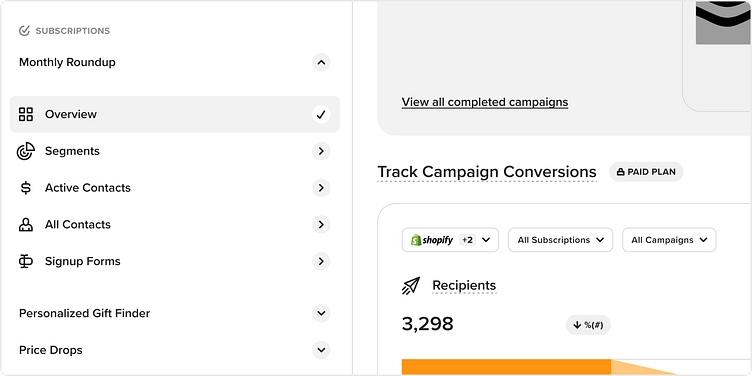
Subscriptions
'Subscriptions' were proposed as a way for Cakemail users to separate their subscribers and manage consent for each mailing without bloating the app with multiple lists. Subscriptions would also help centralize important data and assets related to each mailing, making it easy for users to find what they need without all the extra clutter.
👇
Insights & Widgets
Diving into Posthog's dashboards and graphs, I got a real sense of how they're put together. Along the way, I caught a few usability snags and brainstormed ways to smooth them out. The goal was to tweak and fine-tune these features, ensuring that once integrated into Cakemail, they’d be really user-friendly and intuitive.
👇
Key Pages and Updates
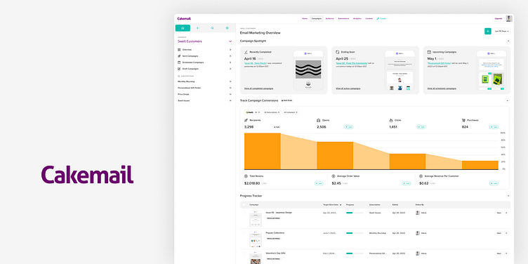
Dashboards
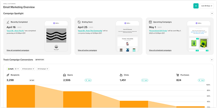
To help Cakemail boost its analytics feature set, I spent a good bit of time defining dashboard templates to help users measure their marketing efforts, and created widgets and graphs with various users and goals in mind.
👇
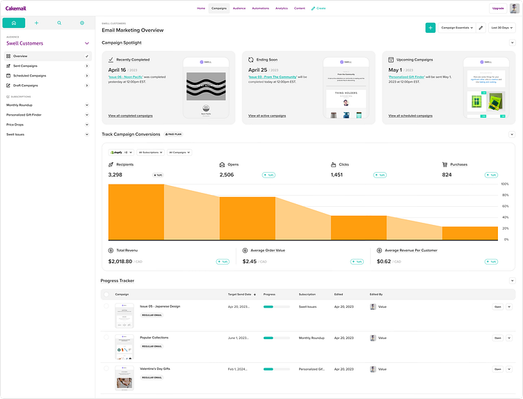
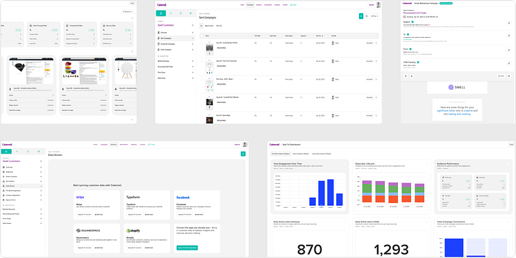
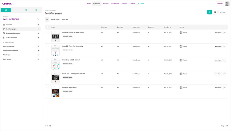
Listings
Listing pages got a much needed tune up. I focused on features and patterns that not only looked good, but brought important data to the surface. The new listing pages give users the tools they need to view relevant campaign data at a glance, with clear callouts to dive deeper when needed.
👇
Drafts
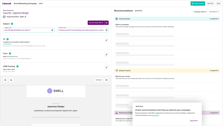
Along with bringing the UI in line with the rest of the app, I was tasked with leveraging AI features as a way to nudge users to premium plans. I designed the page with a central split. On one side, users can see the essential details for launching their campaign. The other side offers a teaser of AI-generated advice on content, design, and performance – just enough insight to pique interest, but fully accessible only beyond the paywall.
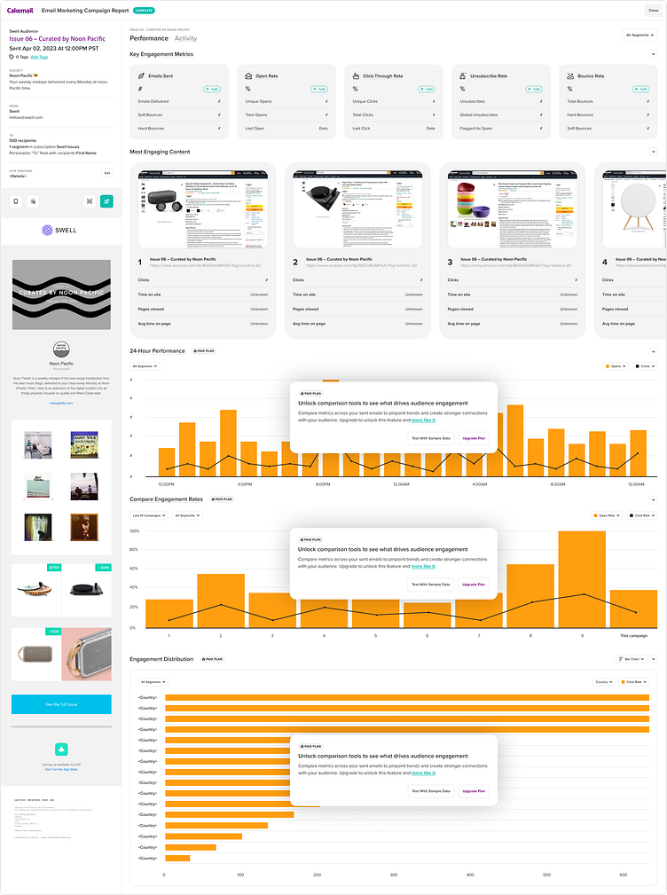
Campaign Reports
Here I reused and tuned dashboards components to individual campaigns. I packed campaign details into a tight column, leaving the bulk of the space to display stats on campaign engagement. This gives users the context they need when first landing on the page while prioritizing important campaign metrics. Some report tools are only available to premium plan holders, so users are encouraged to upgrade their plan or try stuff out with sample data.
👇