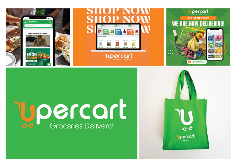
upercart logo and advertising design
Client Brief:
Upercart, an innovative online grocery platform, sought a logo that encapsulated its swift delivery service, convenience, and seamless connection between local stores and customers. They wanted a design that communicated speed, freshness, and reliability.
Research & Conceptualization:
Understanding the Brand: Research was conducted on Upercart’s mission, values, and its unique selling proposition. The focus was on its swift delivery model and connection with local stores.
Visual Concepts: Initial brainstorming involved concepts related to speed (arrows, lightning bolts), grocery items (fruits, vegetables), and connectivity (networks, links).
Sketching & Iteration: Rough sketches of various concepts were made, combining elements like grocery bags, delivery trucks, and speed-related symbols. Iterative refinement narrowed down the options.
Design Development:
Symbolism: A logo depicting a grocery cart as a powerful symbol. The bag represented groceries and the tire signified speed and quick delivery.
Color Palette: Vibrant and fresh colors such as green (for freshness), white (for reliability), and a orange (for confidence) were chosen to resonate with Upercart’s brand values.
Typography: The font style was selected to be modern, clean, and easily readable, complementing the overall design of the logo.
