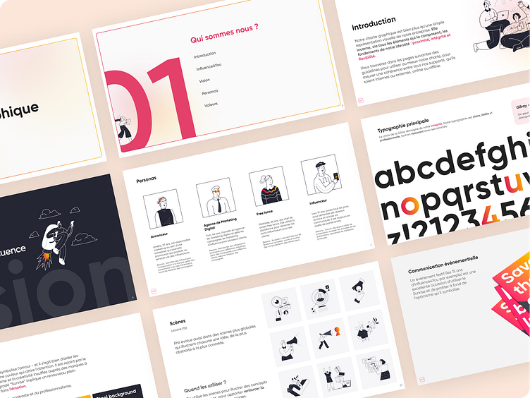
Brand guidelines - Influence4You
I had the opportunity to work on Influence4You rebranding. Former illustrations were a little outdated, and the overall brand image could use a more modern vibe.
I defined and focused on the brand's core values (proximity, flexibility and integrity) to come up with the new visual direction. Colors, fonts, illustrations and tone of voice were all carefully chosen to enhance these values and to create a cohesive experience for our users everywhere (socials, events, website, newsletter...). Empathy was one of our main concern, as we always kept in mind ways to engage, interact, and understand users needs and expectations with the new guidelines.
Influence4You's platform is very comprehensive, and users are expected to be quite autonomous. We made visual choices in order to reassure users and convey professionalism and simplicity. For example, we used a clear and round font, to convey a soft but confident tone of voice. We changed the logo for softer and more subtle shapes. We also added a pink-to-yellow gradient to our color palette, to embody energy and opportunity. We even added a touch of humor (with our new outline illustrations), to have users feels engaged and happy to use the product.
In the end, the new identity was more in line with current trends, and made the product more cohesive. Customer feedback was really positive.


